About PM4Web

The PM4Web blog was born as an outlet to return knowledge back to the web development community. My goal is to share my experiences as a project manager from over the years in a manner which helps you succeed with your own projects.
Showing posts with label wireframes. Show all posts

02 October, 2008

Wireframes and Mockups - Part I

Lo-Fi techniques for creating effective UI wireframes.

Part 1 focuses on lo-fi approaches such as pen and paper-based techniques. Part 2 is concerned with more refined tools for producing polished UI mockups.

UI mockups, or wireframes, are a major part of any respectable functional specification. A functional specification is a description of how the software will work from the user’s point of view. This article doesn’t cover the reasons why you need a functional specification, for this I would suggest Joel Spolsky’s article Painless Functional Specifications. The focus of this piece is to describe and analyse a few approaches for creating UI mockups.

I’m sure there are many other approaches for creating wireframes, but I can only describe and comment on the ones I have used, making some general statements on what is good (or bad) about them.

Lo-Fi Prototyping – this is just the fancy name for the old butcher’s paper approach. Hands down, its the best technique when a new shrink-wrapped software package is being designed. It really lends itself to collaborative effort, it gets the creative juices flowing, and the speed at which you can produce rough screens is unbeatable.
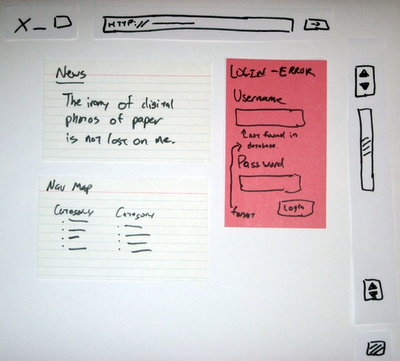
Lo-fi Prototyping

I once spent four days with a group of developers in a small apartment designing a telecommunications application using this technique. The result was just short of astounding, it allowed us to blast out and iterate ideas very quickly. As the UI designer for the team, I went home at the end of the week with a mass of paper which I turned into over 30 HTML mockups.

This approach is unsuitable for designing simple business websites or software which has been done before (e.g. non-novel systems like a shopping cart). It’s also not so great when a client is directly involved in the project. There are a few reasons for this; it requires a big investment of time on the client’s behalf (they may have a business to run during the day), and secondly; the client-to-supplier relationship often creates a dynamic where they tell you what they want, and you go off and make it. Normally, the client wont hang around whilst you design their software.

Microsoft Excel – yes, as strange as it may sound, MS Excel can be quite handy for producing wireframes, especially for software which is expected to have long vertically scrolling screens. I would never have thought to use it myself, but a company I worked for introduced me to it as their preferred spec’ing tool.
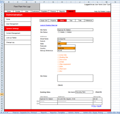
MS Excel Wireframe

At first I was skeptical, but I quickly warmed to the approach when I saw how fast screens were to make once I got the hang of it. It’s excellent for inserting instructions to programmers (either in comments or as side-bar text). It does however produce exceedingly ugly wireframes; this is a good thing for application design since it keeps everyone’s focus on usability and business logic.

The other great thing about Excel is everyone is familiar with it, including clients. The closest thing I could think of as a criticism of Excel as a wireframe tool is that it produces decidedly uninspiring visuals. I currently don’t use Excel as a wireframe tool, but I would have no problem picking it up again if I felt it was right for a project.

Microsoft Word - another desktop application you wouldn't normally think of as a wireframe tool, Word can be pretty good in certain situations. Generally, the only time I would use Word to represent UI controls is if I am making a ‘mini-spec’ for a web-based application.
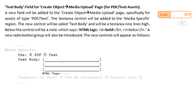
Wireframes in MS Word

A mini-spec is created in one of two situations; as an adjunct to an already ratified functional specification, or as a mechanism for grouping together a bunch of features for a version upgrade. UI controls are represented in a very rudimentary fashion, for instance; (*) would be a radio button, and [x] would be a checkbox, etc.

This works because the interface for the system has already been established (i.e. the system has been coded or a Photoshop mock-up exists). The advantage of this approach is speed; you describe the underlying functionality of the code and only mock-up the controls relevant to the feature rather then drawing the entire screen.

Continue on to part 2 of this article to find out how Visio and Photoshop can be used to produce highly refined mockups.

Wireframes and Mockups - Part II

Techniques for creating polished UI mockups.

Part 2 focuses on tools for producing polished UI mockups. Part 1 is more concerned with lo-fi approaches such as pen and paper-based techniques.

Over the past few years I have been exposed to a number of techniques for preparing mockups. Each approach has its strengths and weaknesses, but generally the best method to use depends on the project at hand. I don’t have a single preferred approach, but choosing the most appropriate style to use at the time can be a tricky undertaking.

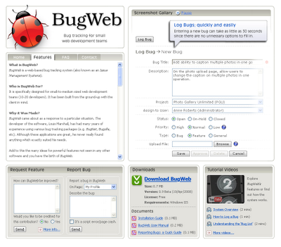
HTML mockups – with the advent of tools like Microsoft FrontPage and its successor Web Expression, anyone can make cool looking mockups, to the point where it seemed as though all that was left to do was hand over the HTML to the programmers, and they would take care of the rest.

HTML mockup

I’ve used FrontPage to make HTML mockups quite a bit in the past. Some analysts say its a very strong option for designs because it allows you to produce navigable HTML. From my experience, I don’t think its a good choice to use as a first draft system, it can be time consuming and lures you to distraction by unnecessary detail early on (i.e. making the design ‘look pretty’).

The biggest problem with HTML mockups is you have nowhere to put annotations (i.e. generally tech notes directed at programmers describing ‘under the hood’ functionality). As far as navigable mockups go, I’ve never found it to be a big issue with flat mockup structures. Generally people know where pages are going to go to, and in rare cases when a page is going to the wrong place, its nearly always a rudimentary task to direct it elsewhere.

There is one instance when a HTML mockup is appropriate straight away. This is when a complex new screen is being added to an already established interface. The reasons for this are beyond the scope of this article, but suffice it to say that experience has shown that its quicker then first creating a lo-fi version of the UI. One of the other great things about HTML mockups is that they’re easy to distribute to people.

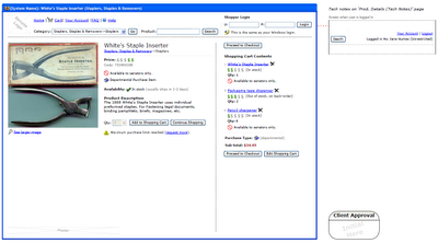
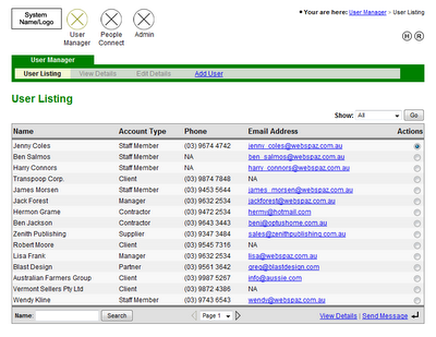
Microsoft Visio – this is the tool I use at the moment for wireframes. It strikes a good balance between flexibility, professionalism, and speed. Visio is great for putting in tech notes without interfering with the wireframe itself, I generally put these in a sidebar to the right.

Visio wireframes

Visio interfaces come out looking nice and plain, which is what you want. It also has drop-in vector art for all the most common form controls you need (e.g. textboxes, radio buttons, etc).

I find that Visio is well suited for use with clients and their custom web applications. The only fault I can find with Visio is its hard to distribute files, few people have Visio installed on their computers (especially clients), but this is easy to get around, I just print wireframes to PDF.

Photoshop – mainly used by graphic designers to create compelling visual layouts. The beauty of Photoshop is realism. This can be quite exciting since it creates a real buzz on a project, as though things are starting to shift from concept to reality.

Photoshop is best used for creating a single highly polished UI screen. For example, just the home page of a business website, or just the landing page of a web-based application. I have seen graphic designers produce every expected screen of a business website in Photoshop, this is totally unnecessary. The client will get what their website is going to look like from just the home page (i.e. it establishes what the overall look and feel of the website will be).

Photoshop mockup

The obvious short-coming of employing Photoshop is the skill required to use the program, it often takes years just to become proficient with the tool. Iterations can often be slower then other techniques, especially when a complex design with many layers is involved. On the plus side, distribution is a breeze since Photoshop can save image files which anyone can open (e.g. JPEG or PNG).


One of the perils of making wireframes which are seen by a client is the tendency to get distracted by cosmetic factors (e.g. client: “why is everything grey?”, “can we have that button in green?”, “that’s not our logo!”).

Generally what I do before designing anything is tell the client “I’m going to make some very rough mockups of how the screens will look. It wont be pretty, but at the moment we are trying to lock-down where buttons go, the general layout, etc”.

This is where methods like lo-fi prototyping or MS Excel can be helpful, because the screens can’t help but look hideous. The danger with mockups in HTML or Photoshop is that effort can be spent early on ‘making it pretty’. The problem with making things ‘look pretty’ at early stages is time gets wasted when iterative adjustments occur (which they will).

Iterations are the name of the game when designing a system, especially early on. If this is the case then you want to choose the approach which is going to allow you to churn out revisions at super-high speeds.