Part 2 focuses on tools for producing polished UI mockups. Part 1 is more concerned with lo-fi approaches such as pen and paper-based techniques.
Over the past few years I have been exposed to a number of techniques for preparing mockups. Each approach has its strengths and weaknesses, but generally the best method to use depends on the project at hand. I don’t have a single preferred approach, but choosing the most appropriate style to use at the time can be a tricky undertaking.
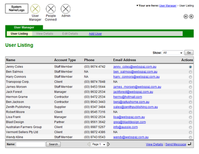
HTML mockups – with the advent of tools like Microsoft FrontPage and its successor Web Expression, anyone can make cool looking mockups, to the point where it seemed as though all that was left to do was hand over the HTML to the programmers, and they would take care of the rest.

I’ve used FrontPage to make HTML mockups quite a bit in the past. Some analysts say its a very strong option for designs because it allows you to produce navigable HTML. From my experience, I don’t think its a good choice to use as a first draft system, it can be time consuming and lures you to distraction by unnecessary detail early on (i.e. making the design ‘look pretty’).
The biggest problem with HTML mockups is you have nowhere to put annotations (i.e. generally tech notes directed at programmers describing ‘under the hood’ functionality). As far as navigable mockups go, I’ve never found it to be a big issue with flat mockup structures. Generally people know where pages are going to go to, and in rare cases when a page is going to the wrong place, its nearly always a rudimentary task to direct it elsewhere.
There is one instance when a HTML mockup is appropriate straight away. This is when a complex new screen is being added to an already established interface. The reasons for this are beyond the scope of this article, but suffice it to say that experience has shown that its quicker then first creating a lo-fi version of the UI. One of the other great things about HTML mockups is that they’re easy to distribute to people.
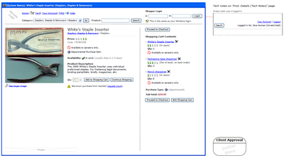
Microsoft Visio – this is the tool I use at the moment for wireframes. It strikes a good balance between flexibility, professionalism, and speed. Visio is great for putting in tech notes without interfering with the wireframe itself, I generally put these in a sidebar to the right.

Visio interfaces come out looking nice and plain, which is what you want. It also has drop-in vector art for all the most common form controls you need (e.g. textboxes, radio buttons, etc).
I find that Visio is well suited for use with clients and their custom web applications. The only fault I can find with Visio is its hard to distribute files, few people have Visio installed on their computers (especially clients), but this is easy to get around, I just print wireframes to PDF.
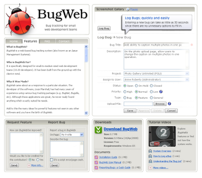
Photoshop – mainly used by graphic designers to create compelling visual layouts. The beauty of Photoshop is realism. This can be quite exciting since it creates a real buzz on a project, as though things are starting to shift from concept to reality.
Photoshop is best used for creating a single highly polished UI screen. For example, just the home page of a business website, or just the landing page of a web-based application. I have seen graphic designers produce every expected screen of a business website in Photoshop, this is totally unnecessary. The client will get what their website is going to look like from just the home page (i.e. it establishes what the overall look and feel of the website will be).

The obvious short-coming of employing Photoshop is the skill required to use the program, it often takes years just to become proficient with the tool. Iterations can often be slower then other techniques, especially when a complex design with many layers is involved. On the plus side, distribution is a breeze since Photoshop can save image files which anyone can open (e.g. JPEG or PNG).
One of the perils of making wireframes which are seen by a client is the tendency to get distracted by cosmetic factors (e.g. client: “why is everything grey?”, “can we have that button in green?”, “that’s not our logo!”).
Generally what I do before designing anything is tell the client “I’m going to make some very rough mockups of how the screens will look. It wont be pretty, but at the moment we are trying to lock-down where buttons go, the general layout, etc”.
This is where methods like lo-fi prototyping or MS Excel can be helpful, because the screens can’t help but look hideous. The danger with mockups in HTML or Photoshop is that effort can be spent early on ‘making it pretty’. The problem with making things ‘look pretty’ at early stages is time gets wasted when iterative adjustments occur (which they will).
Iterations are the name of the game when designing a system, especially early on. If this is the case then you want to choose the approach which is going to allow you to churn out revisions at super-high speeds.

No comments:
Post a Comment
Note: Only a member of this blog may post a comment.