About PM4Web

The PM4Web blog was born as an outlet to return knowledge back to the web development community. My goal is to share my experiences as a project manager from over the years in a manner which helps you succeed with your own projects.
Showing posts with label UI. Show all posts

14 June, 2010

Why Users Demand a Top-Notch Interface These Days

How UI and usability are changing the focus of software development.

Let's take a trip down memory lane. I knew years ago I wanted to be involved in UI design. Back at university I enjoyed making 'pretty interfaces', and for some reason had an inexplicable ability to retain information about design patterns. Sometimes my aptitude for UI design gave people the impression that it came easy to me, but like most people who've gotten good at something, there's a lot of hard work behind it all. The truth of the matter is that the skills had to be refined with long hours of research, reading, experimentation, and most importantly doing interface design.

By far, experience has been my biggest teacher. I've learned that it's 'not done until it's done'; if a UI design has to go though 14 revisions - so be it (and this has happened to me!). If something can be done with 2 clicks instead of 3, than that's my goal (than, I start thinking about how it can be done with just 1 click). I could tell years ago that companies would one day be scrambling for people with Interaction Design (IxD) skills. When software development began shifting away from desktop applications and towards web-based systems, it was clear a fundamental change was on its way (in terms of how we use computers). A number of other trends gave strength to this revolution, including; pervasive broadband uptake, mobile/wireless broadband becoming reasonably priced, and Apple consistently changing peoples' technology-use behavior.

The World is Flat (book cover)One of the driving forces behind this fundamental shift was surely everyone getting access to low-cost 'always on' broadband. Without this, it simply could not have happened. If you've had the pleasure of reading Thomas Friedman's The World Is Flat, you'll see that the reason we ended up with pervasive broadband was partly due to the optic fiber 'fire sale' which took place after the dot com crash. In a nutshell; what happened was businesses invested heavily in expensive optic fiber cable. Then they went broke and were forced to sell their assets. Other companies came along and snapped up all this cheap cable at a bargain price (which in turn, they passed on the savings to customers).

Technology wasn't the only catalyst for change. Another big factor was the shift towards the Application Service Provider revenue model. Finally the industry had found a way to stop software piracy dead in its tracks (i.e. host the software online and get users to pay a subscription fee for access to the service).

Personally, I think that thanks to companies like Microsoft, Google, and Apple the average Internet user has become spoiled rotten in terms of the UI and user experience they expect. The bar has been set very high, but people don't appreciate that Google and others pour millions of dollars into their interface design efforts. People now expect this level of quality from all their Internet enabled software. This is probably a good thing since it forces companies to produce software the way it should be; designed for normal human beings, self-evident (i.e. no manual required), and suitable for a broad audience.

So why is it that Internet users demand such high standards from their online software today? I'd say it's because 'doing things online' has become a cultural norm, or even a borderline necessity. Gone are the days when paying bills online or booking airline tickets was something only nerds did. Would you not look at a colleague sideways if they said "I'm just popping down to the post office to pay a bill" (as opposed to paying it online)? The reality is people still are clinging to the old way of doing things (e.g. people still physically go down to the bank).

The next stage of 'doing things online' could coincide with the dissolution of the traditional outlets of commerce. For instance; there are ISPs now who expect you to sign-up online, and they only accept payment via automated electronic mechanisms (e.g. monthly direct debit). Is it so far-fetched to think that in the not too distant future we will be voting in elections via a website?

The media has also played a pivotal role in this transition. Notice how every poster at a bus stop these days has the Facebook and Twitter logo on it? Mainstream media's ability to shape social habits shouldn't be underestimated.

Dilbert - confusing user interfaces

As more of the traditional physical outlets of commerce disappear in favor of their lower-cost online variants, it's as though the general public is being forced to do things online. If that really is the case, than the number of non-tech savvy users will skyrocket. This is what causes the demand for high quality interfaces, because large numbers of people who wouldn't normally do things online are beginning to convert. The companies that can deliver ease of use will no doubt prosper whilst those slow adapt will fall by the wayside.

Join RSS FeedSubscribe to RSS Feed.

18 May, 2009

Consistency in Web UI Design

How to keep your software's UI consistent when many programmers are working on the project.

In a development team with half a dozen programmers all working on the same project, creating a uniform user interface can be a nightmare. There can be problems ranging from inconsistent use of icons to language (e.g. formal vs. informal). So the question is, what's the best way to achieve a cohesive user experience?

Few would argue the importance of UI design these days, especially since companies like Google and Apple have spoilt users with dazzling almost joy-to-use interfaces. But a functional application is still more important at least initially, you can always pretty things up once your software actually works.

When working as a UI designer, it was my responsibility to create mockups for the application being developed. Once I had created the HTML and image files in Web Expression and Photoshop, all I needed to do was bring them into Visual Studio as Master Pages. This worked out great because the programmers would then come along and add the logic.

This turned out to be an excellent approach since it doesn’t require a style guide or volumes of documentation. It works because just one person was in charge of the UI design. The reality is most companies don’t hire someone specifically for a UI role, although more companies are starting to (compared to a few years ago).

Having worked as an IT project manager for a few years now, I have found there is another approach which works well for ensuring UI consistency. Personally, I don’t put much faith in writing UI guides and expecting programmers to follow them. There’s a few reasons for this: 1) programmers often aren’t good at UI design, 2) it’s a lot to remember, and 3) its counter-productive.

UI style guides slow down programmers because you are expecting them to be good at something which they aren’t geared for; they are good at coding, so let them code.

So what do you get when you let programmers do their thing and just code with no specific guidance on UI? Inconsistencies in the interface. This even happens when you provide programmers with mockups to work from. For example, your mockup might not contain the exact wording for an error message so a programmer, quite rightly, proactively puts one in (e.g. “Invalid input”).

What’s the solution? Easy, you have one person review the entire interface at milestones and log bugs in the issue tracker. These bugs would be marked as UI or low priority. If there’s a script error in the software, it’s obviously more important to fix that first before looking at a UI glitch.

The next question is, who should be doing the interface review? It should be one person only (for consistency sake), and that person should be whoever is the most talented with HCI/UI design.

My point is this, don’t make programmers try and be UI designers. When you log a UI bug, it’s there in the issue tracker, it won’t go away. The programmers will come and fix them when they are good and ready. UI bugs are generally easy to fix so they can act as a good break for a programmer. Imagine a coder has just spent 2 hours debugging a serious data corruption issue. Fixing a few UI bugs would most likely come as a welcome relief.

As far as language or wording in an application goes (e.g. error messages, online help, labels, etc), you wouldn’t necessarily need to log bugs for that. If you are using a string table, or some kind of configuration file like XML, then it’s easy for the UI person to tweak text by directly accessing the configuration store. For example, if you found "login error" in the configuration XML file, you could change that to "the username or password you entered is incorrect".

dilbert - interface design

When things get written down they will be forgotten. This is especially the case when documents get long (e.g. 20+ pages). The problem becomes compounded when you realize that programmers could care less about consistent UI across all the screens of an entire application. Their task lists often say 'Code login screen', not 'Code login screen - and make it look pretty'.

As a side note, I should say I have written a massive UI style guide for an application I designed. It took me almost 2 weeks to write and personally I think it was unnecessary. It was basically a way for programmers to understand how to modify the interface once I finished my contract. As to whether they found the guide useful or not, I don’t know. I think design should be left to designers and coding should be left to programmers, it just makes good business sense.

Join RSS FeedSubscribe to RSS Feed.

06 February, 2009

10 Usability Tips for Your Web Applications

Simple tips and techniques for improving the usability of web-based applications

Usability is a quality attribute that assesses how easy user interfaces are to use. The word "usability" also refers to methods for improving ease-of-use during the design process.
- Jakob Nielsen

It’s definitely an exciting time to be part of the software development industry, companies are really starting to embrace usability in a serious way. Not so long ago usability was an after-thought or novelty, a specialty field only trendy types took interest in. Now, any developer worth his salt appreciates the significance of usability. This is a good thing for users since they are the main beneficiaries of the trend (i.e. they are getting more usable, or better, software). Obviously, those companies investing in usability knowledge will possess a competitive edge as well.


During my software development travels I have come across a few nuggets of usability wisdom which I’m inclined to share. What follows is a short list of some of these tips and tricks. These suggestions are mostly applicable to web-based applications, although there is no reason why they can’t be applied to standard websites.

1. Provide in-place animated feedback – using a JavaScript pop-up to tell a user they’ve forgotten to fill in a required field is not only old-school but just down-right annoying. You need to place a notice as close as possible to the point of error. In addition, it should not require a page reload, it should just appear in place using CSS and JavaScript.


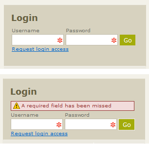
In the example picture below you can see a fairly standard looking login box. The lower portion shows what happens when you click the ‘Go’ button without entering a username or password (i.e. a warning message appears). What you can’t see here is that the background for the red warning box was actually an animated GIF which started as a deep red color and faded to the pastel red you see. This animation makes it blindly obvious to the user where the problem is.

2. Put important messages in a yellow box – its common knowledge that users skim information on websites. The danger of this is that they may miss important information as they attempt to muddle their way through your content. The trick here is to encapsulate the information in a nice yellow box. Why a yellow box? Because it resembles a post-it note. People associate these with ‘reminders’ or important tit-bits of information.


3. Highlight recently added features – some of the more common approaches for letting users know when features have been added to their system include; sending them an email with a list of new features, putting a list of new features on the home page of their system so they see it when they log in, or putting it on a wiki which you expect them to come look at. In an ideal world these tactics would probably work. Failing that, it’s far more effective to just highlight the new feature in some way (whether that’s with a pastel colored background or a little icon that says ‘New’). An additional point is that these highlights should ‘fade’ over time, meaning that after one month, the highlight should disappear.


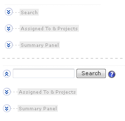
4. Hide features a user wont initially use – I’m sure there is no doubt in your mind that your software is fantastic, you can’t wait to unleash the fury of the 400 features your software has to offer. But spare a thought for the poor user who enters your application for the first time, they are suddenly inundated by buttons, drop-down menus, icons, pop-ups, fancy controls – it’s a foreign land, and the user is like a French exchange student who’s forgotten their phrase book back home. What can you do to help? By setting expanding panels to their collapsed state by default. When the user logs in for the first time, they wont be bombarded with widgets, instead they will be pleasantly surprised by the simplicity of your interface and will probably think to themselves “this doesn’t look so complicated, I can get this in no time”. Don’t worry, users will be curious and explore, they will click the expanding icons and discover how things work in their own time.


5. Let users reduce the complexity of their interface – this is similar to the Hide features a user wont initially use principle since its about reducing interface clutter. But this is something which is more likely to happen after your users has experience with your application. For example, a user may become so familiar with the system after a couple of months that they no longer need any pop-up help. These kind of options would commonly appear on a My Profile or Settings page. A word of caution here; allowing a user to set their interface to 'Beginner' or 'Advanced' mode may seem like a great idea, but what does this really mean? How does the user know what features will be hidden in 'Beginner' mode? Maybe some of the things you consider to be advanced features, the user would think of as being basic.


6. Give feedback messages which say what just happened – if you are giving users some kind of feedback after a button is pressed, that’s great (e.g. “Operation Successful” or “Task Completed” shown in a box at the top of the page). Taking this one step further involves presenting a little extra information about what just happened. For instance, rather then just saying “Upload Successful”, you may display a message like “The file holiday.jpg has been uploaded”. Why bother? Well, the web being what it is, people often wonder off or task switch in the middle of something. They could start some process in your application and switch to another browser tab or go read an email. Ten minutes later they come back to your application and wonder “what was I doing again?” Be sure to use feedback message sparingly, for reporting significant actions, especially for things which aren't instantaneous.


7. Use a red star inside textbox controls to indicate a required field – there’s nothing ground breaking about using a red star to signify a mandatory field, this is more of an optimization on an old concept. What you are doing is using CSS to set the background of a textbox control to a GIF of a big red star. This saves a little space and gives some additional control over UI layout. The other significant factor is it’s big, making it virtually impossible for a user to miss.


8. Provide a way to reset a control or interactive element – why provide a reset button? Because its a long way to the browser’s refresh icon or to the F5 key. Well, it’s not really that far, but you do whatever you can to optimize the speed with which a user interacts with your application. There is also some logic to placing a reset button near the controls it affects, it’s just a matter of convenience. To a certain extent this is a question of personal taste as you don't really need a reset button for most fill-in forms. This is one of the reasons why I use a small 16x16 icon for a reset button as I don't believe the space taken up by a full reset button is warranted.


9. Pre-fill textboxes with suggestions or instructions – if you have the space available, why not make use of it to give users informative suggestions or instructions. In the example below, you can see a portion of a standard contact form. A user can either choose an option from the drop-list or start typing in the adjacent textbox. The moment a user clicks in the ‘or’ textbox, the pre-filled text is blanked-out so they can type in their own custom subject. Below this is another textbox, this time we are letting the user know that this is an optional field. Using gray text rather then black is preferable since it diminishes the attention it attracts (its of minor importance in the overall scheme of things).


10. Use arrows to visually connect related controls – using a bent arrow to say “hey, these radio buttons affect how this textbox works” can be a real boost to the effectiveness of an interface. It provides a natural flow rather then the usual disjointed placement of controls. In the example shown below it would be pretty clear to a user that they have two options for refining the scope of their search (i.e. the arrow indicates an implicit connection between the controls).


Armed with these new usability tricks, you are ready to go forth and make the world a better place, or at least make your software more usable. Because usability isn’t a directly tangible thing that can be listed on a project schedule, it’s often ditched in favor of more features or additional quality testing. This way of thinking isn’t going to last much longer as more users are spoilt by the fantastic interfaces they receive from companies like Google and Apple, people are coming to expect usability as a given, not a treat.

Special thanks to Dmitry Fadeyev of Usability Post for his excellent suggestions which helped improve this article.