About PM4Web

The PM4Web blog was born as an outlet to return knowledge back to the web development community. My goal is to share my experiences as a project manager from over the years in a manner which helps you succeed with your own projects.

17 October, 2008

Needs Analysis for Business Websites

Questions to ask your client before building their website.

This article is most relevant to people who develop standard websites (e.g. a business’ web presence). If your main focus is web-based applications, this paper may have limited appeal.

Client input is the foundation upon which successful web sites are built. It’s absolutely vital that you get your client to articulate their goals in order for you to successfully deliver their project . To help facilitate this process, a number of questions can be asked relating to areas such as target audience, desired look and feel, and what interactive functionality is required.

A good way to tease out your client’s requirements is to use a Needs Analysis document. This is basically a 2-3 page fill in form, full of questions which prompt the client to think about not just the visual elements of their site, but what they are trying to achieve in concrete business terms.

Using a Needs Analysis form provides many benefits. It often acts as the basis for developing a fee proposal or tender (see Writing Fee Proposals). Unless you know what it is your client wants, you wont be able to cost it with any degree of accuracy. Another advantage of a Needs Analysis form is it can present ideas to the client which they hadn’t previously thought of. This isn’t just a boon in terms of up-selling, it also means features aren’t added mid-way or at the end of a project (e.g. client: “I know you’ve finished my website, but can you just quickly add a photo gallery page?”).

The Needs Analysis form I use is broken up into five sections; Company Details, Graphic Design, Business Related, Technical Requirements, and Programmed Features. I will cover some of the questions contained in each section along with the over-all structure of the form.

I always start documents with a short description of what the document is. This is for the benefit of anyone seeing it for the first time (e.g. Document Purpose: this form is used to gather client requirements...).

Company Details – this section is pretty straight-forward, you record information such as the company name, who the main contact is, address, phone numbers, the client’s position within the organisation, etc. It’s also a good idea to note down any other stake-holders that will be involved in the project, and if the primary contact is able to give approval for the work to begin.

The information gathered in the Company Details section will most likely be needed for producing a quote. It will be especially useful if a sales consultant or business development manager is gathering requirements to hand over to a project manager. From this, the project manager will be able to figure out who's who on a project.

Graphic Design – this section is meant to capture details relating to the website’s visual appearance. It is not so much concerned with layout and colour, but rather communication. The information gathered in this section will be most useful to a graphic designer. Good questions to ask the client include; ‘what image are you trying to portray?’ (e.g. friendly, corporate, innovative, etc), ‘what phrase would best describe your website once it’s launched?’ (e.g. ‘these guys look really professional’), ‘what’s the main goal of your website?’ (e.g. sell products online), ‘what else are you trying to achieve with your website?’ (e.g. promote skin cancer awareness amongst young people), ‘what would you like users to do at your website?’ (e.g. register, buy products, etc).

You also want to ask if the client’s logo and branding material is ready. Your graphic designer will want to get his hands on any digital files as soon as possible (e.g. logos, product photographs, etc). Connected to this, you may want to ask the client if they have a style guide. The topic of Flash vs. static HTML also needs to be discussed since there may be SEO and cost implications.

Another important subject is the intended audience of the website. Questions you could ask include; who is your intended audience? what’s their typical occupation?, what is their age range?, is it mostly male or female?, how often do they use the Internet?

You can ask the client to show you some websites they like and have them explain what it is about each site that appeals to them (e.g. client: “I like the clean layout of the site”, “the animated banner is really cool”, etc). If you know that your client likes a particular style of navigation, it makes sense to use that style for their website.

Notice that none of these questions have to do with layout or color schemes (e.g. where the navigation should be, what font should be use, etc). These considerations should be left to the graphic designer, after-all, they are the expert.

Business Related – these questions aren’t directly connected to the visual appearance or functionality of the website, but they may have an impact on the project itself. For instance, you would want to ask questions like: is your content ready?, how are you planning to market your website once it launches?, are you open to developing in stages to manage costs?, do you require an SEO strategy?, are there time constraints (e.g. client: “we need it ready before we go to a trade show in November”, or “we are printing a brochure next month and want to refer to the website”)?

You may wish to ask a few questions about the client’s competitors, such as; do your competitors have websites? what do you like about your competitor’s websites?, what do you dislike about your competitor’s website? Sometimes finding out what someone doesn’t like can be a great help in determining what they do want.

Probably the most significant of the business related questions is about content. Lack of content can be a real killer. A wonderful website may be developed, but if the content isn’t ready, the site is effectively in limbo. One way to help reduce the risk of this happening is to recommend early on that the client engage a content publisher.

Technical Requirements – these questions are mostly system administration related. For instance; you want to find out if the client already has a hosting provider organised. You also need to know if the client has registered their domain name or if they want you to register additional web addresses on their behalf.

Programmed Features – this section covers the interactive elements of the website. Probably the most important goal of this section is to establish the information architecture of the site. This can be done by asking the client what sections their website should have (e.g. press releases, our work, testimonials, etc). The client may also have a need for interactive pages which require custom coding (e.g. sign-up form, news articles, member’s login, photo gallery, etc).

Other significant questions would include; are you planning to sell anything online?, do you require a CMS?, does your site need to work with an existing database?

Dilbert- user requirements

You’ll generally find that only about 80% of the form’s questions are relevant to any particular project. That being the case, it makes sense to remove or cross-out irrelevant questions before meeting with your client (e.g. you would probably know before-hand if any e-commerce facilities are needed).

Another idea is to pre-fill as much of the form as possible. Besides the obvious benefit of saving time in the face-to-face meeting, it demonstrates you’ve paid attention to verbal requirements which may have already been discussed.

07 October, 2008

Time Management in a Multi-project Environment

Time and task management in a multiple concurrent project environment.

It’s a major concern that some people believe there is a perfect time management software out there that will fix all their scheduling woes. This challenge can’t be surmounted with technology alone, there are aspects of habit at play here, not to mention the inherently unpredictable nature of software development (e.g. do you know how many bugs your software will have after launch?).

The PRINCE2 manual says that a staff member can only do 3.5 days of productive work in a week (out of 5 days). Other tasks like meetings, answering the phone, attending Janice’s farewell party, and so on take up the remaining time. I have been at a company where management believed staff were capable of 4.5 days of productive work per week; this was pure fantasy, wishing something were true doesn’t make it so. Perhaps this was a misapplication of Parkinson’s Law.

In simple terms, Parkinson’s Law states that people will use up all the time they are given to undertake a task (e.g. it may take 2 hours to stack 1000 magazines, but if you give someone 4 hours to do it, they will take 4 hours). This notion is commonly misinterpreted to mean you get more out of people if you squeeze them, put them ‘under the pump’, give them impossible dead-lines to meet. Sure, this mentality may produce some short term gains, but it is also likely to result in despondency in staff and increased turn-over.

If increased productivity is desired, there are more positive ways this can be achieved (e.g. hiring a casual system administrator instead of using your programmers to do tech support work). I believe Parkinson’s Law can be a useful tool, but only for yourself - it shouldn’t be projected onto other people.

Dilbert - moving objectives

You can schedule programmer time quite nicely using Joel Spolsky’s Painless Software Schedules technique, it’s dragging them off work unexpectedly that’s the killer (see Project Schedules with Google Spreadsheets for an enhanced version of Joel’s approach). I’ve worked at a company where this was common practice (i.e. pulling programmers off work to do other work). The result was a scheduled which had unreliable delivery dates, the schedule still served its purpose as far as task tracking went though.

In an effort to alleviate this problem, I came up with a system loosely based on critical path theory which I called ‘primary/secondary programmer’. An example of how this works would be; you have two programmers on a project. One is known as the primary and has 20 hours of allocated work, the other is called the secondary, he has 10 hours of work. If 5 hours of new work pops up, it’s given to the secondary. The secondary would now be lagging 5 hours behind the primary, but he can still complete his work before the primary does. The project can’t be considered complete until the primary finishes all his work, so you would intentionally give the primary programmer more work then his comrade (e.g. a 65:35 ratio).

There is a company tackling time management with low-tech solutions quite effectively for their particular environment. One thing which they do is have a central ‘time wrangler’, if you wanted a programmer to work on something, you would have to go through the time wrangler to book him. This was done by submitting a resource request via email; just a simple work summary which looked like this:

Client name:           Blue Widgets Inc.
Job name:              Bug fix, ID: 59
Preferred person:      Michael Smith
When it will be ready: 11:00am Tues (26th July)
Due by:                5:00pm Tues (26th July)
Estimated Hours:       1-2 hrs
Priority:              normal

The time wrangler would use this information to insert a new entry into the programmer’s Microsoft Outlook calendar. When the programmer came in to work, they would see they had a few hours of bug fixing to do. Was this a perfect system? Not really, but it was much better then the ‘running around putting out fires’ approach I have seen elsewhere.

Also notice that ‘Job name’ refers to a bug ID, an issue management system is an absolute must for any software development house. The project manager needs to allocate time for bug fixes in smooth spots through-out the week and at appropriate break points (e.g. between milestones). Bugs should initially be assigned directly to the project manager, not to programmers. From there, the project manager decides priorities and re-assigns bugs or minor feature additions, these should be released to programmers in logical batches rather then just opening the flood gates.

The other impressive idea this company came up with was the creation of a position called ‘maintenance programmer’. It was this programmer’s job to undertake bug fixes and changes on old projects.

This was great news for the other programmers because it meant they could start on new projects without worrying about being dragged away at any moment to fix bugs on a project they worked on last year.

Normally, the best person to fix a bug is whoever originally coded it, but after a year, the benefit of this begins to diminish. Realistically, a maintenance programmer is going to have a hard time understanding the business rules of complex software system they weren't involved with, they are more suited to simpler website upkeep.

You will know your project schedule is working well when programmers only come ask you questions every few days, they know what they have to do next and don’t lose momentum. Another indicator will be that your project post-mortems will show very few logged issues relating to missed functionality (i.e. programmers won’t forget to code things).

Often, poor time management isn’t the result of bad scheduling, it’s usually a project management issue. The project manager is responsible for deciding priorities, not the programmers or the operational manager. This is where I have seen real trouble, when upper management assigns priority without understanding the knock on affect on other projects. I believe people worry far too much about delivery dates when they should be more concerned with time wasting resulting from sub-optimal planning practices.


Notes
Be realistic about the availability of resources. Allowance should be made for holidays and time that people will spend on non-project activities. The average working week is only 4 days after allowing for holidays, training, sickness, etc. Of those 4 days, at least another half-day will be spent on other duties, even by dedicated staff − for example, quality reviewing for other projects, line management and meetings.

- Page 181. Managing Successful Projects with PRINCE2 (3rd Ed.)

02 October, 2008

Wireframes and Mockups - Part I

Lo-Fi techniques for creating effective UI wireframes.

Part 1 focuses on lo-fi approaches such as pen and paper-based techniques. Part 2 is concerned with more refined tools for producing polished UI mockups.

UI mockups, or wireframes, are a major part of any respectable functional specification. A functional specification is a description of how the software will work from the user’s point of view. This article doesn’t cover the reasons why you need a functional specification, for this I would suggest Joel Spolsky’s article Painless Functional Specifications. The focus of this piece is to describe and analyse a few approaches for creating UI mockups.

I’m sure there are many other approaches for creating wireframes, but I can only describe and comment on the ones I have used, making some general statements on what is good (or bad) about them.

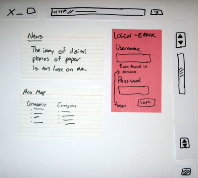
Lo-Fi Prototyping – this is just the fancy name for the old butcher’s paper approach. Hands down, its the best technique when a new shrink-wrapped software package is being designed. It really lends itself to collaborative effort, it gets the creative juices flowing, and the speed at which you can produce rough screens is unbeatable.

Lo-fi Prototyping

I once spent four days with a group of developers in a small apartment designing a telecommunications application using this technique. The result was just short of astounding, it allowed us to blast out and iterate ideas very quickly. As the UI designer for the team, I went home at the end of the week with a mass of paper which I turned into over 30 HTML mockups.

This approach is unsuitable for designing simple business websites or software which has been done before (e.g. non-novel systems like a shopping cart). It’s also not so great when a client is directly involved in the project. There are a few reasons for this; it requires a big investment of time on the client’s behalf (they may have a business to run during the day), and secondly; the client-to-supplier relationship often creates a dynamic where they tell you what they want, and you go off and make it. Normally, the client wont hang around whilst you design their software.

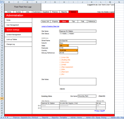
Microsoft Excel – yes, as strange as it may sound, MS Excel can be quite handy for producing wireframes, especially for software which is expected to have long vertically scrolling screens. I would never have thought to use it myself, but a company I worked for introduced me to it as their preferred spec’ing tool.

MS Excel Wireframe

At first I was skeptical, but I quickly warmed to the approach when I saw how fast screens were to make once I got the hang of it. It’s excellent for inserting instructions to programmers (either in comments or as side-bar text). It does however produce exceedingly ugly wireframes; this is a good thing for application design since it keeps everyone’s focus on usability and business logic.

The other great thing about Excel is everyone is familiar with it, including clients. The closest thing I could think of as a criticism of Excel as a wireframe tool is that it produces decidedly uninspiring visuals. I currently don’t use Excel as a wireframe tool, but I would have no problem picking it up again if I felt it was right for a project.

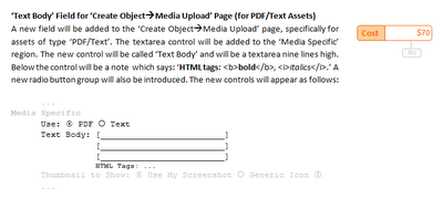
Microsoft Word - another desktop application you wouldn't normally think of as a wireframe tool, Word can be pretty good in certain situations. Generally, the only time I would use Word to represent UI controls is if I am making a ‘mini-spec’ for a web-based application.

Wireframes in MS Word

A mini-spec is created in one of two situations; as an adjunct to an already ratified functional specification, or as a mechanism for grouping together a bunch of features for a version upgrade. UI controls are represented in a very rudimentary fashion, for instance; (*) would be a radio button, and [x] would be a checkbox, etc.

This works because the interface for the system has already been established (i.e. the system has been coded or a Photoshop mock-up exists). The advantage of this approach is speed; you describe the underlying functionality of the code and only mock-up the controls relevant to the feature rather then drawing the entire screen.

Continue on to part 2 of this article to find out how Visio and Photoshop can be used to produce highly refined mockups.

Wireframes and Mockups - Part II

Techniques for creating polished UI mockups.

Part 2 focuses on tools for producing polished UI mockups. Part 1 is more concerned with lo-fi approaches such as pen and paper-based techniques.

Over the past few years I have been exposed to a number of techniques for preparing mockups. Each approach has its strengths and weaknesses, but generally the best method to use depends on the project at hand. I don’t have a single preferred approach, but choosing the most appropriate style to use at the time can be a tricky undertaking.

HTML mockups – with the advent of tools like Microsoft FrontPage and its successor Web Expression, anyone can make cool looking mockups, to the point where it seemed as though all that was left to do was hand over the HTML to the programmers, and they would take care of the rest.

HTML mockup

I’ve used FrontPage to make HTML mockups quite a bit in the past. Some analysts say its a very strong option for designs because it allows you to produce navigable HTML. From my experience, I don’t think its a good choice to use as a first draft system, it can be time consuming and lures you to distraction by unnecessary detail early on (i.e. making the design ‘look pretty’).

The biggest problem with HTML mockups is you have nowhere to put annotations (i.e. generally tech notes directed at programmers describing ‘under the hood’ functionality). As far as navigable mockups go, I’ve never found it to be a big issue with flat mockup structures. Generally people know where pages are going to go to, and in rare cases when a page is going to the wrong place, its nearly always a rudimentary task to direct it elsewhere.

There is one instance when a HTML mockup is appropriate straight away. This is when a complex new screen is being added to an already established interface. The reasons for this are beyond the scope of this article, but suffice it to say that experience has shown that its quicker then first creating a lo-fi version of the UI. One of the other great things about HTML mockups is that they’re easy to distribute to people.

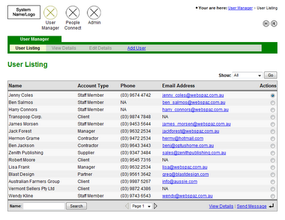
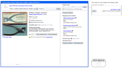
Microsoft Visio – this is the tool I use at the moment for wireframes. It strikes a good balance between flexibility, professionalism, and speed. Visio is great for putting in tech notes without interfering with the wireframe itself, I generally put these in a sidebar to the right.

Visio wireframes

Visio interfaces come out looking nice and plain, which is what you want. It also has drop-in vector art for all the most common form controls you need (e.g. textboxes, radio buttons, etc).

I find that Visio is well suited for use with clients and their custom web applications. The only fault I can find with Visio is its hard to distribute files, few people have Visio installed on their computers (especially clients), but this is easy to get around, I just print wireframes to PDF.

Photoshop – mainly used by graphic designers to create compelling visual layouts. The beauty of Photoshop is realism. This can be quite exciting since it creates a real buzz on a project, as though things are starting to shift from concept to reality.

Photoshop is best used for creating a single highly polished UI screen. For example, just the home page of a business website, or just the landing page of a web-based application. I have seen graphic designers produce every expected screen of a business website in Photoshop, this is totally unnecessary. The client will get what their website is going to look like from just the home page (i.e. it establishes what the overall look and feel of the website will be).

Photoshop mockup

The obvious short-coming of employing Photoshop is the skill required to use the program, it often takes years just to become proficient with the tool. Iterations can often be slower then other techniques, especially when a complex design with many layers is involved. On the plus side, distribution is a breeze since Photoshop can save image files which anyone can open (e.g. JPEG or PNG).


One of the perils of making wireframes which are seen by a client is the tendency to get distracted by cosmetic factors (e.g. client: “why is everything grey?”, “can we have that button in green?”, “that’s not our logo!”).

Generally what I do before designing anything is tell the client “I’m going to make some very rough mockups of how the screens will look. It wont be pretty, but at the moment we are trying to lock-down where buttons go, the general layout, etc”.

This is where methods like lo-fi prototyping or MS Excel can be helpful, because the screens can’t help but look hideous. The danger with mockups in HTML or Photoshop is that effort can be spent early on ‘making it pretty’. The problem with making things ‘look pretty’ at early stages is time gets wasted when iterative adjustments occur (which they will).

Iterations are the name of the game when designing a system, especially early on. If this is the case then you want to choose the approach which is going to allow you to churn out revisions at super-high speeds.