About PM4Web

The PM4Web blog was born as an outlet to return knowledge back to the web development community. My goal is to share my experiences as a project manager from over the years in a manner which helps you succeed with your own projects.

27 February, 2009

Best Practice Shopping Website Design – Part 1

A general discussion on interface design and usability within online shops.

Due to the length of this article it has been split into two parts. Part 1 covers aspects of shopping websites such as the login mechanism, product searching, and the shopping cart. Part 2 focuses on the checkout process and the user’s My Account page.

The key to great usability for an online shop is familiarity. People have been buying goods online for years now, they expect to see a certain process unfold when shopping online, and when a designer makes radical departures from the status quo, tears may ensue (regardless of how good the designer’s intentions may be). Does this mean a designer is locked in to reproducing the same old shopping interface again and again? Not necessarily, but conforming to certain standards is going to help the user.

This article analyzes the usability of components commonly found within most shopping website (e.g. the cart, the checkout process, etc). The idea isn’t so much to be prescriptive and lay down hard and fast rules, but rather to describe what is going to be most familiar to shoppers. Creativity and deviation from the norm is a good thing on the web, otherwise things would get pretty boring. But being aware of the de facto standards on shopping websites allows you to make informed decisions when taking a novel direction.

The Login box – there is some variation in how shopping websites deal with user log ins. Some sites require that a person log in before making a purchase, whereas others allow for guest accounts. The obvious basics would be a username and password field. The only pitfall here would be labeling the username field ‘Email’. ‘Username’ is the more ubiquitous label, it helps cut-down on possible confusion which could arise if there were say a newsletter subscription box near by.

login box

Most of the choices to be made within this interface element relate to naming; do you call it ‘Register’ or ‘Sign-Up’?, should you label your commit button ‘Go’ or ‘Login’?, is your password recovery link called ‘Password recovery’ or ‘Forgot your password?”. Whatever labels you choose, you should favor brevity, generally nothing longer then three short words.

After a person logs in, there is an opportunity to reclaim some precious screen real estate by removing UI elements which aren’t needed anymore. Showing the shopper’s name helps to personalize the service and thus makes it a little friendlier (nb. you could go with ‘Welcome John Smith’ instead of ‘Logged in as: ...’). This is also a good place to show the ‘My Account’ and ‘Logout’ links since both these functions are logically related to the shopper’s account.

By the way, a ‘Logout’ link is somewhat redundant since closing the browser window serves a similar purpose (assuming the session has expired), but a logout feature may help alleviate any security-related concerns a shopper may have.

The product search mechanism - the textbox for product searching is pretty straight-forward, but product browsing can go in a number of directions. In the screenshot below, I have used a drop-list to show product categories.

product search and browse

This works great if the category hierarchy is flat, it saves space plus you know the UI won't behave unexpectedly if the product list gets long. But what if you have sub-categories (e.g. Fishing→Hooks, Fishing→Knives, Fishing→Bait, etc)? Sure you could use a dash to indicate a sub-category, but the drop-list option would start to lose some of its eloquence.

Categories and sub-categories can be treated just like site navigation, which is essentially what it is (i.e. product navigation). Common approaches are to use CSS fly-outs or in-place expanding panels (much like Windows Explorer).

As an added touch, I like to put a reset icon near the search button. This lets the user return the searching mechanism to its initial state without having to go all the way to the browser refresh button or press the F5 key.

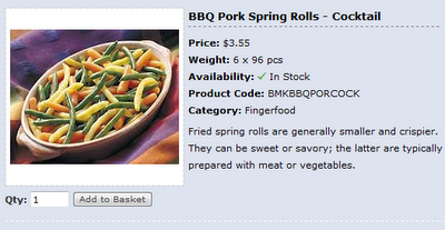
The shopping basket – the structure of a shopping cart has become fairly standardized these days. You have the product name with a hyperlink back to the full product description, the price of the individual product, and the quantity the shopper wants to buy.

shopping basket

I like to add a small bin icon so shoppers can easily remove items from their basket that they no longer want. You could also add a sub-total at the bottom of the shopping cart, but I don’t think this is necessary since the user will be shown a sub-total during the checkout stage.

Another feature which improves usability is feedback messages. It’s important to let the user know when something happens as a result of their interaction with the system, for instance; showing a short message when an item is added or removed from their cart.

The product details page – one of the biggest decisions here is whether to have a product listing page in addition to a detailed product description page. If you were just using a listing page for products, you would show short descriptions along with each product. The alternative would mean that a shopper has to click a product’s summary in order to see its full details.

Generally I decide this based on how much information is going to be shown with a product. If it’s only expected that a few lines will appear for each product’s description, then a product details page wont be needed. However, this may have significant SEO consequences since each product doesn’t have its own name appear in the browser page title-bar. It could be argued that the summary-on-listing page interface is more effective in terms of usability since a shopper gets all the information they want with fewer clicks.

product details

The paging mechanism – the approach I take with paging is not widely used, you could say that the UI I prefer is more a matter of personal taste. The common representation is to show a series of hyperlinked numbers (e.g. < 1 2 3 4 5... etc), but this tends to be quite fiddly.

The other issue with listing a series of hyperlinked numbers is you can only show so many before you have to fall back to an ellipsis to represent a gap (e.g. < 1 2 3 4 ... 57 >). I prefer to go with a few icons and a drop-list. A drop-list of page numbers lets shoppers jump to a specific page quickly and easily.

The reality though is most people will only need to step forward or backward one page at a time, or jump back to the start of the products list (or to the end), so why waste space on a series of hyperlinked numbers very few shoppers will ever use?

paging

This concludes part 1 of Best Practice Shopping Website Design. In part 2, we take a look at the stages of the checkout process and what the shopper’s My Account page should look like.

06 February, 2009

10 Usability Tips for Your Web Applications

Simple tips and techniques for improving the usability of web-based applications

Usability is a quality attribute that assesses how easy user interfaces are to use. The word "usability" also refers to methods for improving ease-of-use during the design process.
- Jakob Nielsen

It’s definitely an exciting time to be part of the software development industry, companies are really starting to embrace usability in a serious way. Not so long ago usability was an after-thought or novelty, a specialty field only trendy types took interest in. Now, any developer worth his salt appreciates the significance of usability. This is a good thing for users since they are the main beneficiaries of the trend (i.e. they are getting more usable, or better, software). Obviously, those companies investing in usability knowledge will possess a competitive edge as well.


During my software development travels I have come across a few nuggets of usability wisdom which I’m inclined to share. What follows is a short list of some of these tips and tricks. These suggestions are mostly applicable to web-based applications, although there is no reason why they can’t be applied to standard websites.

1. Provide in-place animated feedback – using a JavaScript pop-up to tell a user they’ve forgotten to fill in a required field is not only old-school but just down-right annoying. You need to place a notice as close as possible to the point of error. In addition, it should not require a page reload, it should just appear in place using CSS and JavaScript.


In the example picture below you can see a fairly standard looking login box. The lower portion shows what happens when you click the ‘Go’ button without entering a username or password (i.e. a warning message appears). What you can’t see here is that the background for the red warning box was actually an animated GIF which started as a deep red color and faded to the pastel red you see. This animation makes it blindly obvious to the user where the problem is.

2. Put important messages in a yellow box – its common knowledge that users skim information on websites. The danger of this is that they may miss important information as they attempt to muddle their way through your content. The trick here is to encapsulate the information in a nice yellow box. Why a yellow box? Because it resembles a post-it note. People associate these with ‘reminders’ or important tit-bits of information.


3. Highlight recently added features – some of the more common approaches for letting users know when features have been added to their system include; sending them an email with a list of new features, putting a list of new features on the home page of their system so they see it when they log in, or putting it on a wiki which you expect them to come look at. In an ideal world these tactics would probably work. Failing that, it’s far more effective to just highlight the new feature in some way (whether that’s with a pastel colored background or a little icon that says ‘New’). An additional point is that these highlights should ‘fade’ over time, meaning that after one month, the highlight should disappear.


4. Hide features a user wont initially use – I’m sure there is no doubt in your mind that your software is fantastic, you can’t wait to unleash the fury of the 400 features your software has to offer. But spare a thought for the poor user who enters your application for the first time, they are suddenly inundated by buttons, drop-down menus, icons, pop-ups, fancy controls – it’s a foreign land, and the user is like a French exchange student who’s forgotten their phrase book back home. What can you do to help? By setting expanding panels to their collapsed state by default. When the user logs in for the first time, they wont be bombarded with widgets, instead they will be pleasantly surprised by the simplicity of your interface and will probably think to themselves “this doesn’t look so complicated, I can get this in no time”. Don’t worry, users will be curious and explore, they will click the expanding icons and discover how things work in their own time.


5. Let users reduce the complexity of their interface – this is similar to the Hide features a user wont initially use principle since its about reducing interface clutter. But this is something which is more likely to happen after your users has experience with your application. For example, a user may become so familiar with the system after a couple of months that they no longer need any pop-up help. These kind of options would commonly appear on a My Profile or Settings page. A word of caution here; allowing a user to set their interface to 'Beginner' or 'Advanced' mode may seem like a great idea, but what does this really mean? How does the user know what features will be hidden in 'Beginner' mode? Maybe some of the things you consider to be advanced features, the user would think of as being basic.


6. Give feedback messages which say what just happened – if you are giving users some kind of feedback after a button is pressed, that’s great (e.g. “Operation Successful” or “Task Completed” shown in a box at the top of the page). Taking this one step further involves presenting a little extra information about what just happened. For instance, rather then just saying “Upload Successful”, you may display a message like “The file holiday.jpg has been uploaded”. Why bother? Well, the web being what it is, people often wonder off or task switch in the middle of something. They could start some process in your application and switch to another browser tab or go read an email. Ten minutes later they come back to your application and wonder “what was I doing again?” Be sure to use feedback message sparingly, for reporting significant actions, especially for things which aren't instantaneous.


7. Use a red star inside textbox controls to indicate a required field – there’s nothing ground breaking about using a red star to signify a mandatory field, this is more of an optimization on an old concept. What you are doing is using CSS to set the background of a textbox control to a GIF of a big red star. This saves a little space and gives some additional control over UI layout. The other significant factor is it’s big, making it virtually impossible for a user to miss.


8. Provide a way to reset a control or interactive element – why provide a reset button? Because its a long way to the browser’s refresh icon or to the F5 key. Well, it’s not really that far, but you do whatever you can to optimize the speed with which a user interacts with your application. There is also some logic to placing a reset button near the controls it affects, it’s just a matter of convenience. To a certain extent this is a question of personal taste as you don't really need a reset button for most fill-in forms. This is one of the reasons why I use a small 16x16 icon for a reset button as I don't believe the space taken up by a full reset button is warranted.


9. Pre-fill textboxes with suggestions or instructions – if you have the space available, why not make use of it to give users informative suggestions or instructions. In the example below, you can see a portion of a standard contact form. A user can either choose an option from the drop-list or start typing in the adjacent textbox. The moment a user clicks in the ‘or’ textbox, the pre-filled text is blanked-out so they can type in their own custom subject. Below this is another textbox, this time we are letting the user know that this is an optional field. Using gray text rather then black is preferable since it diminishes the attention it attracts (its of minor importance in the overall scheme of things).


10. Use arrows to visually connect related controls – using a bent arrow to say “hey, these radio buttons affect how this textbox works” can be a real boost to the effectiveness of an interface. It provides a natural flow rather then the usual disjointed placement of controls. In the example shown below it would be pretty clear to a user that they have two options for refining the scope of their search (i.e. the arrow indicates an implicit connection between the controls).


Armed with these new usability tricks, you are ready to go forth and make the world a better place, or at least make your software more usable. Because usability isn’t a directly tangible thing that can be listed on a project schedule, it’s often ditched in favor of more features or additional quality testing. This way of thinking isn’t going to last much longer as more users are spoilt by the fantastic interfaces they receive from companies like Google and Apple, people are coming to expect usability as a given, not a treat.

Special thanks to Dmitry Fadeyev of Usability Post for his excellent suggestions which helped improve this article.

03 February, 2009

What Does an IT Project Manager Do? - Part I

A description of the responsibilities of a typical project manager in the IT industry

This article is split into two parts due to its length. Part one starts with an introduction which describes the role a project manager plays during software development.

If you looked at the most prominent job searching website in your region you would find that different industries mean different things when they use the word project manager. For our purposes, we are going to talk about a typical project manager within the software development industry. By no means is this an exhaustive treatment of their duties and chances are good that no single person in a company would undertake all the tasks described here.

Before we can say what a project manager does, we should first take some time to define what a project actually is. We know that a project is often a novel undertaking, an attempt to create or achieve something which hasn’t been done before (hence why projects are inherently risky). The other identifying features of a project include; they have a deadline, a set budget, and a beginning and end point.

A project can be broken into a number of components; design, programming, project management, quality control, etc. These are just the titles I use, but they do have direct parallels with traditional waterfall model stages (e.g. programming = implementation, quality control = testing, etc). For simplicity, I usually roll requirements gathering and system analysis into the project management component. I tend to refer to components rather then phases or stages. The reason for this is because it’s limiting to try and force a software development project into a series of linear steps. It just doesn’t turn out that way because there is so much iteration and overlap between stages (e.g. project management is a process that occurs the whole way through a project).

To get a project done you obviously need people with specialized skills, these people are often geographically distributed, whether that’s down the hall from each other, or on another continent. The chances of these people coming together as an organized group is pretty slim. And this is where a project manager comes onto the scene.

So then, what is a project manager? You could say they are the glue that binds things together, they don’t actually do the work, but rather help others do it. They are at the helm of a ship, steering it via a predefined route to a particular destination, with course corrections to be expected along the way.

Sure, this is a somewhat simplistic definition, but we are just getting started. If we were to expand on our description, we could also say a project manager is meant to make the unpredictable predictable, ensure resources are used wisely, and handle problems which seem to appear out of nowhere.

The purpose of software is to solve a business problem or exploit an opportunity. Based on this goal, a project manager is likely to assist in figuring out what features the application should have. Before a project begins in earnest, they also have to determined if the project is technically feasible and not prohibitively expensive.

Dilbert, what does a project manager do

A project manager should know about the people on his team and what their capabilities are. Who’s good at JavaScript? Who knows about video encoding technology? Who’s the best person to research a shopping cart component? This isn’t just a matter of utilizing peoples’ strengths, but also making them happy by allowing them to do what they like. For example, creating a timesheet template may be hell for one person, but sheer joy for another.

Setting up the ground rules for communication is also the domain of a project manager; is the team going to have regular meetings or impromptu chats? Are we using MSN or Skype to talk to our overseas contractors? How often will programmers report their progress so the project schedule can be kept up-to-date?

Scheduling is arguably the most important task a project manager undertakes. He needs to know if there are any dependencies (e.g. an Internet Merchant Account has to be setup before credit card payments can be accepted on a website). They need to be aware of any external factors affecting the project’s deadline (e.g. the client wants to show off the software at a trade-show in two months). Regardless of what tool is used, the project schedule needs to at least say what is going to be done by when, how much time tasks will take, and who is doing what.

Resource allocation is a juggling act project managers need to excel at. Which programmer should work on what? When can they work on the next project? How much time should be set aside for bug fixing? Often companies will have multiple projects running simultaneously. This makes it quite tricky to get the most out of the limited resources available.

Making sure that the software solution delivered to the client is bug free and in fact what they asked for is another major responsibility of a project manager. This could involve writing tests plans, creating quality assurance standards, defining acceptance criteria, and organizing independent testers to carry out testing. A project manager is often the first person a client contacts when they find a bug in their software, ideally the client should be logging defects in a bug tracking system. The project manager then assigns the logged bugs to the most appropriate programmer for resolution.

A project manager is responsible for risk management. They need to be aware of what can go wrong and how likely it is to occur. Finding out about it after it happens is too late, a good project manager will spot a problem coming from a mile away and have a plan ready for dealing with it.

A project manager might need to consider external factors like: competition, industry standards, future market forces, environmental issues, social and political impact. It’s quite rare for a project manager to be called upon to analyze and document these forces (e.g. they may do this as part of an e-strategy). Most of the time this information would be in the client’s business plan.

At smaller companies it’s not unusual for a project manager to wear a number of different hats. For instance, they will commonly double as a business analyst, responsible for writing functional specifications, creating wireframes, making recommendations on technology, and deciding what development tools to use. They may even have minor administrative duties like preparing invoices for clients.

Read part two of this article... (not available yet)