About PM4Web

The PM4Web blog was born as an outlet to return knowledge back to the web development community. My goal is to share my experiences as a project manager from over the years in a manner which helps you succeed with your own projects.

04 October, 2009

Making Customers Part of the Development Process

Helping customers understand and get involved with their software project.

The importance of talking to customers about how you will be building their software shouldn’t be underestimated. If you wait until the project is under way to begin managing a customer’s expectations, you'll find it’s too late; expectations have already been set (not necessarily in a good way either).

You can generally assume that in a client's mind, the methodology you use is unimportant minutiae, they are not interested in the nuts and bolts of the process. They only care that the project gets done. This is not to say that the SDLC approach used is trivial; some clients are more suited to an Agile approach whilst others will be happier with classic waterfall. In the case of B2B, where a client may have a technical stake-holder directly involved with the project, keep in mind that there’s no point being ‘agile’ if your client doesn't buy into this too.

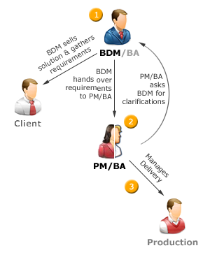
Whether developers use Agile or waterfall model is beside the point from a client’s perspective, these are purely internal processes. The only time a client needs to know about the process is at their interaction points. This is like encapsulation in object oriented programming; all a coder needs to know is what the interface looks like and how to interact with it. The inner workings of the function are not his concern.

The key to involving clients with the development process is to only discuss processes which involve them directly. Clients need to know ahead of time what they're getting into and what to expect. Surprising a client with new information half-way through a project often sounds like an excuse. Some development houses use a 'client education pack'. I believe this is a good idea as long as a project manager walks the client through it either in person or over the phone. Assuming a client will want to read a 20 page process manual you send them is just wishful thinking. The client needs to be part of the development process at any point where their input is required. Examples of this would be: meeting with you to describe what the software is meant to do, providing content for their website, approvals (e.g. design sign-off, UAT, etc).

Arguably the most important point to bring up with a client is the effect of adding features to a project already under way (i.e. ‘scope creep’). There's more to this than just saying "if its not in the spec, it will cost extra". There are implications relating to delivery date and more subtle dangers like new features breaking previously working ones. You may have techniques for dealing with these issues such as incorporating a change request budget into the fee proposal or requiring that non-critical features be implemented after initial release.

Another important topic is the interconnected nature of features. Functional dependencies aren’t just confined to the realm of coding, they may extend to tasks requiring a client’s involvement. For instance; a client may not know that credit card transactions can’t be processed on their ecommerce-enabled website until they get an Internet Merchant Account and sign-up with a credit card clearing service.

It’s unrealistic to think business interactions will go smoothly 100% of the time with all customers. That would be like thinking you can please everyone; you can't. This brings up the subject of choosing your clients, or even dropping troublesome ones. Dropping a client would seem counter-intuitive, after all, a business is there to make money, so turning away a paying customer seems kind of crazy.

The reality is that on occasion you will encounter clients who are inflexible or uncompromising. The author Stephen Covey perceptively described the outcomes of interpersonal conflict in his famous book Seven Habits of Highly Effective People. They generally follow this structure: win/win, win/lose, or no deal. In terms of conflict with a client, the win/lose situation would be: 1) developer insists on following their internal process but angers the client (win/lose), 2) developer compromises their process to keep the client happy, but delivers a shoddy product (lose/win), 3) the developer drops the client (no deal). Ideally you would go for win/win situations as much as possible, where both parties get what they want without taking away from the other. A win/win solution is nearly always possible if both parties sincerely commit to working on a solution until an amicable outcome is achieved.

It's important to keep the big picture in mind, if it’s only a trivial point, it’s best to let it slide. For example; a client may insist on red flashing text on their homepage. In such a case all that needs to be said is: "this is a usability concern, I can still change it for you if you like but it will hurt the quality of your website."

Dilbert - clients and development methodology

At the end of the day it's not the responsibility of the client to understand software development, or anything else for that matter. Their primary responsibility is ensuring that enough budget is available to bring the product to fruition. The technology supplier’s part is to deliver on what’s been promised. Using the hottest development methodology doesn't mean anything if you’re losing business or ruffling your client's feathers. Software development is a service industry; clients aren't concerned with how teams or projects are managed to an intricate level, they care about what they've paid for: results.

Join RSS FeedSubscribe to RSS Feed.

09 September, 2009

Writing a Design Brief

Questions to ask before undertaking any creative project.

Comedian Chris Rock mused in one of his stand-up shows that "you can drive a car with your feet if you want to; it don't mean it's a good idea!" The same can be said for starting a creative endeavor without first taking down a design brief; you can certainly do it, but that doesn't make it a good idea.

What's a design brief meant to do? The idea behind the design brief process is to tease out what the client has in mind. It's meant to extract the visual communication requirements of the project. Whether it's the creation of a website or a brochure, the questions answered during the process will act as a guide for the development of the end product.

Why is a design brief even needed you may ask, can't we just 'wing it' and see how it turns out? After all, creativity shouldn't be constrained by bureaucratic procedure. This is definitely true, you don't want to apply stringent protocols to a creative endeavor, it can actually stifle the flow of creative juices. That said, a design brief is about moving from a vague idea to something firm that everyone can agree on. It's about moving away from "I'll know what I like when I see it" to a shared sense of the project's purpose.

Should you run into the attitude of "just get on with it", it falls upon you to explain the importance of undertaking the briefing session. Something along these lines should suffice: "the design brief session takes about 15-25 minutes. It needs to be done so I can produce a high quality product for you."

So what does a design brief document look like, and how do you conduct the briefing session? The template I use is a simple Word document about a page and a half long. It consists of 15 questions. There is also a preamble section with a short paragraph describing the document's purpose and another one on why the design brief is needed. On average, the briefing session itself takes about 20-30 minutes to complete. It can be done in the board room or at a cafe, it makes no difference since its an interview-style format.

Let's take a look at some of questions you may want to include in your own design brief document. I should state that this template is best suited to smaller projects, like the creation of a ad for a niche magazine, or the development of a business website presence. It won't cut it for that Coca-Cola campaign you're pitching for. It's simple enough for anyone to use, not just professional graphic designers.

Target audience - You are trying to find out who the material is intended for. You want to know things like the audiences' age, gender ratio, locality (national vs. international), occupation, etc. Why would such information be relevant? Take age for instance, if you were making a business card which is destined to be handed to seniors, it wouldn't be a good idea to use a tiny font on it.

Organization background - you should have a basic understanding of what your client's business does. Getting a brief history of your client's business will give context to the work you are doing.

Communication objectives - what message is are you trying to convey? What feeling or metaphors reflect the spirit of the product or company? For example; is the client going for a corporatey image or something more fun and friendly?

Market positioning - this connects closely to communication objectives. Is the client trying to appear like a big established company or an innovative new-comer? Do they want to appear as an international player or something more exclusive?

Business objectives - what is the client actually trying to do with this piece of marketing material? Is it meant to act as a sales tool, is it meant to encourage inquires, or is it meant to promote brand awareness?

Overall design goals - is the client going for continuity with their existing marketing material or are they trying to establish a new brand or product?

Keywords indicative of the product - this is an opportunity to get some alignment with what your client has in mind. For example; you may ask "what are some words that describe the logo I'm designing for you?", the client may come back with "simple, credible, professional".

Colors - is there a company style guide you need to follow? It could be that the client has some particular colors they wants you to try out. Otherwise, you would state you intend to stick with the existing corporate branding color scheme.

Hierarchy of information - what should grab the audience's attention first? This question is especially relevant for websites. Take a website selling a new product, you would expect the 'call to action' to have a very prominent position on the homepage.

Where to find inspiration - ask the client to show you examples of work similar to the style they want used for the project. With a website, you may ask "can you show me some websites you like?"

Design examples - it’s not enough to just see the examples, you want to find out what the client likes or dislikes about them (e.g. "its a simple design, I like that" or "our competitors website is cluttered with text"). There could be many aspects which appeal to your client, including: color, imagery, typography, atmosphere, etc.

Artwork and content readiness - its best to find out early if things like logos are available in a high-res digital format, or if the copy text is ready. This often serves as a heads-up to the client, letting them know they have work to do as well (i.e. preparing the content for their website). It may also act as a signal to indicate a copywriter is needed on the project.

Time constraints - its vital to know when the work has to be ready. Your client may have an expo coming up which requires brochures to be printed and ready before-hand.

Budget and resource constraints - how much time and money is available for the project? There has to be some kind of alignment between your client's expectations and what you can deliver based on their budget and deadline. You may even find you can't take on the project, better to know this early on than commit to something you can't achieve.

Language to use - should the text appearing in the product be informal, corportey, inspirational, emotive? This may not be relevant to you if a copywriter is involved in the project.

Dilbert, graphic design department rushed

As mentioned earlier, the design brief acts as a guide. It should be looked at periodically at various stages of the project to make sure you're on track. It should also be reviewed when the product is completed, to check that the original objectives of the project have truly been met.

Join RSS FeedSubscribe to RSS Feed.

26 July, 2009

Conducting a Usability Review

An approach for unearthing usability issues in web-based systems.

You don't see the spots before your eyes until they are there.
- Chinese proverb

These days people expect so much from a user interface. Thanks to companies like Google, Microsoft, 37Signals and many others, web surfers have come to expect a world-class user experience no matter what application they use. People don't care if a multi-million dollar budget is available or not, the 'big boys' have spoiled them rotten and exceptions are high. This is bad news if you don't have a skilled UI person on your development team (or if you don't have the budget to hire someone for a short-term contract).

The consequence of sub-standard usability on a website may be subtle. For instance; if your online shop crashes when a person adds an item to their basket, they may be inclined to tell you about it. But if it’s something seemingly innocuous like locating contact details inside your 'About Us' page (instead of within a dedicated contact page), there's a good chance visitors wont even be able to find contact details to let you know something's gone wrong.

This is where a usability review comes in (or usability audit if you prefer). Conducting a usability review requires a certain kind of knowledge and expertise not common to all IT professionals. The same way a person may have a knack for SEO or picking up new programming languages, such is the nature of UI design. The intuitive aspects of usability and HCI analysis, like any other skill, can be learned, but not everyone is inclined to do so. Therefore, some kind of guiding template would be useful to those not willing to commit vast amounts of time to mastering the discipline. A usability review can provide just this kind of structure.

What sort of project would benefit from a usability review? Pretty much any system which has been developed without the direct input of a usability expert from the start. If a usability specialist has been engaged from the onset of the project, chances are good that many usability best-practices have already been implemented. In this situation, you'd be better off spending time conducting usability testing instead of investing time in a usability review (e.g. watching end-users directly interact with the system).

So what does a usability review look like? The structure is quite simple; it’s just a Word document full of bullet points describing two things: what the problem is, and a suggestion for fixing it.

For example:

  • Use of ‘click here’ hyperlinks - this is dated and passé (also poor in terms of SEO).
    Fix: remove instances where ‘click here’ is used with hyperlink (e.g. ‘click here for sales enquiries' would become 'make a sales enquiry').

You may wish to create a few sections within the Word document to make it more manageable (e.g. Interface Issues, Visual Communication & Branding, Information Architecture, Error Messages, Content & Language, etc).

The big question of course is; what to look for when conducting your review. This is a tricky question because in truth, the answer is far beyond the scope of a simple blog article like this. That said, I have prepared a basic list of a few common UI errors to keep an eye out for:

  • Flag distracting animations as a usability issue (e.g. Flash)
  • Show the file size of downloads (e.g. Annual Report PDF - 200 KB)
  • Watch for poor typography usage (e.g. small fonts for headings)
  • Keep an eye out of misaligned controls and UI elements.
  • Review online forms for consistency (e.g. widths of textboxes)
  • Be watchful for unintuitive error messages written by programmers
  • Is there online help for complicated forms or interactive tasks?
  • Should form fields marked as required be optional instead?
  • Are required fields obviously marked in some way?
  • Can some labels on forms be shortened (e.g. 'Phone' to 'Ph.')
  • Should some labels be expanded to become more understandable?
  • Are large images used which do nothing other than add load time?
  • Are JavaScript pop-ups used for error messages?
  • Is a 'No records found' message shown for unsuccessful searches?
  • Can a user tell where they are within the website?
  • Is the navigation structure unnecessarily deep (>3 levels is bad)?
  • Are there graphics anomalies (e.g. overly compressed JPEGs).

How long does a usability review usually take? Unfortunately, the deeper you go into a flawed system, the more problems you're likely to uncover. There is sort of a snowball effect, so you do have to decide a cut-off point; how long you are willing to spend reviewing each screen (e.g. 45 minutes per page, including writing up corrective notes). The number of problems you unearth is also a function of your skill level, if you're good at it, UI issues will jump out the screen at you. Another thing to consider is this; there's no point conducting a usability review unless you've done at least the most basic of QA testing (e.g. checking for broken links, alerts for required fields on forms, cross-browser compatibility, etc).

Ratbert for QA Group

If you are interested in going further into the realm of usability, I would suggest Steve Krug's book Don't Make Me Think. As far as online resources go, you can't pass up Smashing Magazine (although this is heavily targeted towards graphic designers). There is also Jakob Nielsen's useit.com website and Joel Spolsky's Joel on Software website.

Article Adjunct
  • Usability reviews should be done after conducting at least basic/ad-hoc usability testing with a few users.
  • What you find during user testing should dictate what issues you address first (before a usability audit).
  • As a developer or system architecture working with the software on a daily basis for long periods of time, it becomes easy to miss problems staring you right in the face (i.e. you can't see the forest for the trees).
  • If the usability report is expected to be seen by non-technical stake-holders, it's a good idea to include a short summary at the beginning of the document. This would outline the most important findings of the usability audit.
  • The suggested fixes contained in the audit should also under-go user testing. It's always possible that the suggested fixes don't solve the problem (or they may even introduce new ones).
  • Ideally, the best time to conduct a usability review is early and at multiple stages throughout the SDLC (not just as an after-thought at the end of a project).
- Contributed by Moin Uz Zaman, Senior Usability Specialist


Join RSS FeedSubscribe to RSS Feed.

22 June, 2009

Surviving An Under-resourced Project

How to cut development time on web projects that have a tight budget.

In the competitive world of web development, it's not unusual to be handed a project where the resources available are not adequate enough to achieve the results expected by the client.

A common reason why an under-priced project has been approved in the first place is because someone was desperate to sell a solution to the client. The result is a tight budget where features must be culled and SDLC processes streamlined.

For the sake of illustration, let’s say a client is given a proposal stating that their project will cost $20,000 to build. The client then comes back saying "that’s too much, I have a budget of $16,000 at most." It's not unusual for the person who wrote the proposal to be told "adjust the quote so it comes out to $16,000. We want this work."

We now have a situation where the project has to be undertaken with less money than is ideal. A tight budget isn’t necessarily a bad thing, but sometimes a project can be so drastically under-priced that it is plainly a bad business decision to accept the project in the first place (i.e. a doomed project). There are boundaries where it just becomes ridiculous; if the client were to say "my budget is $4,000", then the company couldn’t possibly take on the project.

Is there any difference in managing a project with a tight budget vs. a amply funded one? The answer is yes. In an under-resourced project all tasks which aren’t absolutely necessary are jettisoned. A big reason for this is so the company has some chance of making a profit or breaking even. Because of these cut-backs, an under-resourced project is often in danger of suffering serious quality consequences.

Since there is no such thing as a project with unlimited resources , the question then becomes a matter of what are the indicators of an under-resourced project. Let’s take a look at some typical tell-tale signs:

  • Bare minimum amount of time allotted to QA
  • Overly bureaucratic process for change requests and off-spec work
  • Change request budget may be small or non-existent
  • Formalized processes get dropped to use time for development
  • No time for value-add QA like grammar or spell checking
  • No allowance for hallway usability testing
  • No on-site installation or support (phone or email support only)
  • No budget for writing user documentation
  • No face-to-face user training
  • Documentation which is out-dated
  • No technology research ('good enough' coding will have to do)
  • No time to produce a risk analysis document
  • Poor or barely existent project schedule
  • Coders don't track their actual time taken for tasks in the schedule
  • Company perks disappear (e.g. food, beverages, etc)
  • No down time - time sheets reflect 100% allocation to project work
  • Progress updates for clients become infrequent and rudimentary
  • Less time is spent understanding the business domain
  • Programmer have to work unpaid overtime
  • A project post-mortem isn't conducted (i.e. lessons learned )

You may notice many of the compromises are quite minor. And there is a reason for this. Under-resourced projects exists at the border line between a project not going ahead at all, and one just barely being ratified. If resources and processes were cut to an extreme level, then the project would be destined to fail no matter what (e.g. a project with no functional spec or project schedule isn’t under-resourced, it’s just plain old crazy).

For project managers finding themselves at the helm of an under-resourced project, there are a few strategies which can be used to not only deliver the project, but also maintain an acceptable level of quality:

Minimize iterations - the more it goes back to the client for feedback, the longer it takes. I know this flies in the face of modern Agile practices, but what I’m saying is to limit the feedback cycle, not abolish it. What does this mean in practical terms? It equates to establishing ground rules with the client early on (e.g. only allowing three iterations to get the wireframes correct). Could this be construed as under-servicing the client, perhaps. But it may also force the client to be decisive rather than relying on iterations.

Use informal sign-offs - use email as much as possible as a sign-off medium. For example; you may send the client a JPEG of their website design and ask them to reply with something along these lines: "I approve the design". It’s a simple time saving strategy because it always takes longer to get a physical signature from a client. Getting informal sign-offs also reduces iterations since the client knows they are officially locking in a decision.

Maintain a production checklist - on a smaller project involving just one or two people, time can be saved by using a production checklist rather than a full-fledged project schedule. A production checklist is just two items in an excel sheet; task and percentage complete. It says nothing about estimated hours. Couldn’t you just drop the production checklist completely and save even more time? Sure you could, but then the chances of missing something becomes a real danger. Back-tracking to include a forgotten task could take more time then the investment in making the production checklist in the first place.

Use passive reporting - instead of chasing programmers to ask where they're at with their tasks, get them to come to you. This can be achieved by asking team members to update their areas in the online project schedule twice a week. Another way is to get team members to email you when they have a deliverable to report (e.g. "the SSL certificate has been installed. I have a confirmation email from the hosting provider").

Propose staged development - if a client has a big project but not enough money to get it done, then suggest they break up the project into a number of stages. The initial or 'core' stage would include the most vital features which they simply couldn’t do without. Later stages would bring in the nice-to-haves and value-add features.

Use a bug tracking system - generally speaking, you should be using a bug tracking system anyway. But it becomes particularly important in under-resourced projects since all time expenditure needs to be allocated with great precision (i.e. there is little room for error).

Use mini-specs - once coding begins, chances are good new features will be requested at intermittent points during development. Rather than adding features during the main development cycle, gather them together into a mini-spec. The items in the mini-spec would be implemented after the originally scoped product is delivered (possibly taking it to version 1.1). By not adding features in drips and drabs, you are optimizing integration.

Do 'feature triage' - be harsh on what features really need to be included in the initial release of the product. It may be painful for a client to accept that they can’t have the world on a shoe-string budget, but something's got to give.

Trim unnecessary tasks - instead of doing two rounds of system testing, do one. Instead of allowing for two on-site visits to conduct user acceptance testing, do one visit and the rest via phone. Do you really need to spend an hour worth of travel for another face-to-face meeting with the client or will a phone call do? If you are observant, creative, and ruthless, you will see many opportunities where time can be trimmed. Of course, hacking away too much will mar the product’s quality and just require time be re-invested for fixes.

Dilbert - estimating project cost

A question which surely beckons attention is what impact a tight budget has on product quality. A client isn't going to accept an excessively buggy product in either a well funded project nor one with tight resources.

You can still attain a level of quality closely approaching a well-funded project. What it comes down to is things like how polished the system looks (e.g. amateurish icons vs. professionally designed ones). There could also be less relationship building with the client since there isn’t as much time for face-to-face meetings. A reduced QA cycle may uncover fewer errors, so the system gets launched with dormant bugs that surface later down the track. Successfully delivering a under-resourced project isn’t impossible, the trick is knowing what to trim and what to keep.

Join RSS FeedSubscribe to RSS Feed.

07 June, 2009

From Requirements to Production

Reviewing the process which takes place from requirements gathering all the way up to production.

Every small web development agency is unique in some way, this is usually what gives them some kind of competitive advantage. Part of that uniqueness is the process they use to convert what a client wants into reality (e.g. a website). This article discusses that process in a big picture kind way, the main focus is on roles - or who does what.

I've seen a few versions of this process at different companies I've worked at, but they mostly involve the same players each time (e.g. a sales rep, a project manager, etc).

Most small web agencies could say their work is divided into two arenas: small web projects and custom development. Small web projects would be basic websites such a business web presence. A custom software build covers all other scenarios (e.g. where a lot of code is written to account for the client’s unique business rules).

The processes described in this article are most relevant to the small web projects stream, mainly because this kind of work is generally the same thing over and over again (e.g. client: "I would like an about us page, and a contact page...").

The players – before we begin the discussion in earnest, we should establish the roles in the process, or 'who does what'. Job responsibilities often go hand-in-hand with a job title, but not always. So, lets introduce the players:

The Players

In the first approach, which I like to call the split-role approach, the process unfolds as follows:

  1. BDM sells web solution to client.

  2. Business Analyst contacts the client to take-down their requirements (and then hands that over to the Project Manager)

  3. The Project Manager organises production resources.

Split-role approach

The alternative method is called the dual-role approach, which looks like this:

  1. BDM sells web solution to client.

  2. BDM gathers requirements from client and hands it over to the Project Manager.

  3. PM/BA reviews requirements (and often asks BDM to gather a few more details).

  4. PM organises resources and ensures delivery

Dual-role approach

I should mention that I specifically haven’t represented the iterative nature of development in either diagram (for the sake of simplifying the diagram).

Each approach has certain strengths and weaknesses. The most obvious difference between the two structures is that the dual-role approach combines the jobs of a Business Analyst and PM into one individual. The benefit of this is it cuts out one communication channel. The downside is it can be hard to find an employee with evenly matched business analysis and project management skills.

The dual-role approach also requires that the BDM have business analyst-like abilities, not as refined as a true business Analyst, but pretty savvy none-the-less. The fact that the BDM is capturing basic requirements takes a load off the PM/BA combined role, allowing them to effectively manage more concurrent projects.

Since the BDM is acting as a watered-down Business Analyst, its likely that the Project Manager/Business Analyst will often need to get clarifications on the requirements which have been gathered. For instance, the BDM may write down: "the client wants to put their products online", to which the PM/BA may say "does the client want to sell their products online, or do they just want an online product catalogue?"

The biggest concern for the BDM/BA combined role is that the skills needed to be a good BDM and a good Business Analyst aren't the same. Most BDMs aren't as structured in their thinking (which is needed to gather solid requirements), but then again most BAs don’t have the soft-skills a BDM generally has.

Pricing considerations - since we are dealing with basic website builds here, it is fine for a BDM to provide a client with a ball-park estimate at the initial client meeting. The final pricing does need to be settled by a proper Business Analyst though, they are the only ones that can cost the project with the least amount of risk.

There is also the issue of up-selling and business re-engineering. On the one-hand, a Business Analyst consulting directly with a client may improve the technology solution by making useful suggestions (split-role approach). The flip side would be a BDM is more likely to get a greater budgetary commitment from the client, due to their selling expertise (the dual-role solution).

Dilbert - Sales Engineer

Personally I prefer the duel-role approach since it reduces the number of communication channels (or 'integration points'). The more communication channels, the greater the risk of losing information or misinterpretations. In addition, small companies generally can't afford to hire specialists (i.e. a specific person for a Business Analyst role, another person for the PM role). I can however appreciate that the split-role approach offers some degree of scalability since there is more division of labour.

Special thanks to members of the Stack Overflow community for their contributions towards this article.

Join RSS FeedSubscribe to RSS Feed.

18 May, 2009

Consistency in Web UI Design

How to keep your software's UI consistent when many programmers are working on the project.

In a development team with half a dozen programmers all working on the same project, creating a uniform user interface can be a nightmare. There can be problems ranging from inconsistent use of icons to language (e.g. formal vs. informal). So the question is, what's the best way to achieve a cohesive user experience?

Few would argue the importance of UI design these days, especially since companies like Google and Apple have spoilt users with dazzling almost joy-to-use interfaces. But a functional application is still more important at least initially, you can always pretty things up once your software actually works.

When working as a UI designer, it was my responsibility to create mockups for the application being developed. Once I had created the HTML and image files in Web Expression and Photoshop, all I needed to do was bring them into Visual Studio as Master Pages. This worked out great because the programmers would then come along and add the logic.

This turned out to be an excellent approach since it doesn’t require a style guide or volumes of documentation. It works because just one person was in charge of the UI design. The reality is most companies don’t hire someone specifically for a UI role, although more companies are starting to (compared to a few years ago).

Having worked as an IT project manager for a few years now, I have found there is another approach which works well for ensuring UI consistency. Personally, I don’t put much faith in writing UI guides and expecting programmers to follow them. There’s a few reasons for this: 1) programmers often aren’t good at UI design, 2) it’s a lot to remember, and 3) its counter-productive.

UI style guides slow down programmers because you are expecting them to be good at something which they aren’t geared for; they are good at coding, so let them code.

So what do you get when you let programmers do their thing and just code with no specific guidance on UI? Inconsistencies in the interface. This even happens when you provide programmers with mockups to work from. For example, your mockup might not contain the exact wording for an error message so a programmer, quite rightly, proactively puts one in (e.g. “Invalid input”).

What’s the solution? Easy, you have one person review the entire interface at milestones and log bugs in the issue tracker. These bugs would be marked as UI or low priority. If there’s a script error in the software, it’s obviously more important to fix that first before looking at a UI glitch.

The next question is, who should be doing the interface review? It should be one person only (for consistency sake), and that person should be whoever is the most talented with HCI/UI design.

My point is this, don’t make programmers try and be UI designers. When you log a UI bug, it’s there in the issue tracker, it won’t go away. The programmers will come and fix them when they are good and ready. UI bugs are generally easy to fix so they can act as a good break for a programmer. Imagine a coder has just spent 2 hours debugging a serious data corruption issue. Fixing a few UI bugs would most likely come as a welcome relief.

As far as language or wording in an application goes (e.g. error messages, online help, labels, etc), you wouldn’t necessarily need to log bugs for that. If you are using a string table, or some kind of configuration file like XML, then it’s easy for the UI person to tweak text by directly accessing the configuration store. For example, if you found "login error" in the configuration XML file, you could change that to "the username or password you entered is incorrect".

dilbert - interface design

When things get written down they will be forgotten. This is especially the case when documents get long (e.g. 20+ pages). The problem becomes compounded when you realize that programmers could care less about consistent UI across all the screens of an entire application. Their task lists often say 'Code login screen', not 'Code login screen - and make it look pretty'.

As a side note, I should say I have written a massive UI style guide for an application I designed. It took me almost 2 weeks to write and personally I think it was unnecessary. It was basically a way for programmers to understand how to modify the interface once I finished my contract. As to whether they found the guide useful or not, I don’t know. I think design should be left to designers and coding should be left to programmers, it just makes good business sense.

Join RSS FeedSubscribe to RSS Feed.

09 May, 2009

Missing or Poor Quality Website Content

Strategies for avoiding the debilitating effects of missing or low quality content.

We’ve all heard the horror stories of websites lingering for months whilst a client attempts to cobble together some semblance of worthy content for their ill-fated website. This problem doesn’t just affect freelance web contractors. It’s as much a concern for a project manager at a web agency. Why? Because a project can’t be considered complete until all its tasks are closed.

Content issues can come in a number of forms, but generally it’s a customer taking a long time to prepare text or pictures for use on their website. Also connected to this is the problem of poor quality content, that is; amateurish text riddled with spelling or grammar errors, or low quality photographs. If this problem was one of the four horsemen of the apocalypse, it would be famine since nothing makes a website appear malnourished like missing content.

So far I can’t say I have figured out a fool-proof method for dealing with this issue, although I have developed a few helpful strategies over the years. One approach I use is to take some liberties with the client’s content. For example, if a client has a page called ‘Our Team’, I may paste in some generic content I find on another website. What does this do? For starters, it often gets the client saying “hey, that’s not my content”, to which you reply “no problem – it’s just a place-holder until you put in your correct text.”

As strange as this may sound, putting in the wrong content often encourages a client to put in the right content. Perhaps this is appealing to the ‘if you want something done right, you got to do it yourself’ part of the customer’s brain. This solution isn’t appropriate for all customers; it works best with people who will understand you are just trying to be proactive.

One approach I have used in the past to deal with missing content is to automatically turn-off pages which are empty. For instance, if there is no text for the website’s ‘Press Releases’ page, it simply doesn’t appear in the navigation. It will only be a matter of time before the client says “where is my press releases page?”, to which you reply “you have to enter some text for the page, otherwise it automatically hides itself”. True, you will get people putting in “Page under construction” or “Coming Soon”, but if you give a person a CMS to manage their website, they can write whatever they like (it is their website after all).

Another great solution is to use a content questionnaire. This is a simple list of questions designed to illicit responses which serve as the basis for producing rudimentary website content. Here are a few example questions: “what does your company do?” “Who are your customers?” “What products or services do you sell?” “Have you been mentioned in any media publications?”. As you can see, you are effectively acting as a basic copy writer, so some degree of writing skill is required.

A common strategy you will see suggested is to have the client engage a content publisher or copy writer early on. The beauty of this is that a copy writer will hound a customer ‘til the end of days for material to work off – it’s their job. Web developers often focus too much on the technology-side of things, neglecting the most important aspect of the website; the content. The downside of this solution is many clients will flag a copy writer as prohibitively expensive. When budget is an issue, things which appear to have the least value are culled. Some clients may even look at it this way: “why should I pay for someone to do something I can do myself? I know my products better than anyone”.

Understandably, if a client has never had any interaction with a copy writer, they may not be aware of how much they can help. It isn’t just a matter of ‘good writing’, a copy writer can create compelling text targeted at a particular audience. For instance, a business owner may write something like this on their website “Welcome to my dieting website. Please browse our extensive range of products”, a copy writer would instead produce “Discover the secrets to fast and permanent weight loss with our revolutionary nutritional supplements”. And if the copy writer is well versed in SEO, even better.

Before this article wraps-up, let’s go over a few tips which may help you avoid content headaches: 1) bring up the topic of content early on in the project, 2) instil a sense of urgency, the client needs to know the website is nothing without content, 3) use generic, place-holder content when appropriate, 4) switch off pages which are blank (manually or via code), 5) recommend a copy writer get involved in the project early on (if budget allows).

Dilbert - urls

When all is said and done, if a client wont supply their content or photos, or blocks your attempts at proactive assistance (e.g. putting in place-holder content), there isn’t a great deal you can do. Your best bet is to move onto your next project and check back periodically to see if they are ready to continue on with their work. This could be in the form of a phone call once every few weeks. You never know, a client may have some major disaster they are dealing with in their business which means they can’t spend time preparing content.

11 April, 2009

Ethics, Morality, and Principles in Web Development

What projects some web developers wont take and why

The topic of morals and ethics in business can be a tricky one since it’s so subjective. To the majority of people, there is an obvious pool of projects they wouldn’t touch with a ten foot barge pole (e.g. ones which are clearly illegal). However, it gets interesting once you start poking around the gray areas, where things transition from blindingly unethical to just morally questionable.

Before we begin, a brief definition of some key terms is required:

Ethics – the discipline dealing with what is good and bad and with moral duty and obligation.
Morality – conformity to ideals of right human conduct.
Principles – guiding sense of the requirements and obligations of right conduct.
(Source: www.merriam-webster.com and www.dictionary.com)

They all look kind of the same don’t they, especially ethics and morality? You could say morality and ethics are more universal or over-arching systems applicable to society at large. Principles seem to be a more personal thing, and this is often where the ‘gray area’ exists.

Why is it that some web developers will take on a project which others won’t? Let’s explore this question by taking a look at a few real-world examples, or ‘mini-case studies’ if you will. Some of these cases are drawn from my own personal experience, whilst others have been relayed to me by peers.

The vegetarian and the abattoir – this is something that happened to me a couple of years ago. I was offered a contract to produce a website for a meat abattoir (i.e. slaughterhouse). What’s the problem you may ask? I’m a vegetarian. This isn’t a big dilemma, none-the-less I politely declined the contract and referred the client to someone equally capable. This is clearly a case of my own personal principles in action; most carnivorous developers would have no problem taking the project.

The designer and the sex toys – this happened to a graphic designer I know. The company she was working for at the time was contracted to develop an e-commerce website for a sex-toy retailer. She asked to be excluded from the project because she felt that it couldn’t be known for sure weather the products being sold on the website were in some way supporting exploitation of women.

Debt collectors and domain squatters – I’m aware of a case in which a developer declined to take a project from a debt collection agency, and another contract from a ‘domain squatter’ (i.e. a person who buys a web address with the intent of ransoming it to its legitimate owner). Turning-down a debt collector is interesting considering it is a legitimate business. His reasoning was that some debt collectors are reputed to use nefarious means to achieve their ends.

Blood and wrestling – this story is about a game programmer. Part of his work involved coding particle effects in a wrestling game. When a wrestler’s avatar was struck, droplets of blood would fly out and stain the canvas floor where it landed. Soon after working on the game he departed the company. He took this experience as a sign of things to come.

The entrepreneurial slave-trader – a developer was offered $15,000 USD to create a website for the purpose of trafficking in humans. Needless to say, he turned down the project and never dealt with that particular ‘businessman’ again.

Many other projects of a questionable nature were mentioned during the course of my research for this article, including; work from home schemes, spam mailers, government grants scams, MSN ID harvesters, website clones, viruses, adware, stock options trading systems, religious websites, etc.

The fact that there’s so much questionable software out there means there are developers who have no problem producing it. In their mind there is probably an acceptable reason for undertaking the work, or perhaps they simply don’t care.

There is also this argument: “for enough money, you’d it”. This basically says that, barring any illegal activity, a person would take a project for the right price. This argument is spurious at best since a situation would never arise where it could actually come true. Why? Because there would always be someone willing to do it for less then the exorbitant rate required to bypass a person’s ‘ethical barriers’.

Dilbert - ethics

There is some irony and even hypocrisy to some of these stories. For instance, I turned down a website which sold animal flesh, but would have no qualms about building a site which uses ‘human flesh’ as a marketing tool (i.e. an online shop for a sex toys retailer). Personally, I see no issue as long as no one has been harmed, duped or taken advantage of as part of the production or selling of the product. I guess this just goes to show that what’s morally abhorrent to one person is logically justifiable to another.

25 March, 2009

10 Common Problems Web Developers Encounter

Solutions to common problems web developers deal with during a project

After spending a few years developing websites both big and small, certain patterns seem to have revealed themselves. Over time, you adapt to these issues and forget about them, but the reality is other people will encounter these problems in due course. For that reason, i thought a quick treatise of these common problems was called for.

Considering the same challenges crop up again and again for everyone in web development, it’s interesting to note that different people come up with different solutions to the same issue. The context often defines what an appropriate solution is, so what works for one business may not work for another. Obviously, I can only talk about strategies I myself have used, or ones suggested to me by my peers (nb. there may be other solutions I haven’t considered).

Without further delay, let’s have a look at some challenges, and more importantly, some solutions:

1. Content issues – this happens when a customer either takes too long to supply their content, or what they do supply is amateurish or lacklustre. The most common way I deal with this is to use some place-holder text, with the intent of having the client say “hey, that’s not my text”; this can prompt them to put in their correct content. Another trick is to use a questionnaire to illicit responses from the client. This can be used as the basis for writing rudimentary content (e.g. “what does your company do?”, “who are your customers?” etc). A technique I have used in the past is to turn off pages which are empty (e.g. client: “where’s my press releases page?”, developer: “the page hides itself if there is no text on it”). I recall reading an article some time back which suggested getting a copywriter involved from the start of the project. Having someone work closely with the client at an early stage is a good method for ensuring copy is ready prior to launch.

2. Delays in obtaining the company logo or graphics files – it’s pretty hard to start on a website when you don’t have the client’s logo. Often this is just a case of getting the client to contact their graphic designer to get you the files you need. This isn’t a major issue, but it can cause a small delay which is unnecessary. All you have to do is give the client forewarning that this material is required. This is why one of the questions I have on my Needs Analysis form is “is your logo & branding material ready?”

3. Vague feedback and indecisiveness – this is a situation which can result in not only delays, but rework which isn’t billed for. This really boils down to ineffective communication. A classic example of vague feedback is “I don’t like the design” (a more helpful version would be something like “the design doesn’t communicate the fun and relaxed nature of our company”). The evil brother of vague feedback is indecisiveness, or when a client is unwilling to make a firm decision on how something should be. With vague feedback, patients is the remedy. Some would say it’s a matter of ‘educating the client’, I find that term to be somewhat condescending. If I get feedback like “I don’t like the design”, I would respond with “what in particular don’t you like?” or “can you be a bit more specific, I need more detail in order to get your design right” (the response depends on the client’s personality, understanding the DISC model helps). In the case of indecisiveness, if it’s related to a feature, I will make it an option in the admin module (e.g. an option to show a group of company logos horizontally or vertically). With this approach, the client can set it whichever way they want.

4. Scope creep – the bane of a developer’s existence. This topic alone could span many pages, however I will try keep it simple. Scope creep occurs when a client asks for features which weren’t originally agreed upon. This can be problematic as it can cause delivery dates to shift and displace other work, it can introduce new bugs in established features, and impact on momentum. Some people take a hard line on this matter, suggesting that you should just say ‘No’ to the client. I have a personal philosophy which goes like this “there is no such thing as no, it’s yes – and this is how much it’s going to cost”. At the end of the day, it’s about business, if a client is willing to pay for the work, it’s simply a matter of project management and version control. One technique I use when developing large web applications is to group features together into a ‘mini-spec’. These features would be added to the system after launch and thus constitute a point upgrade (i.e. v1 ;rarr; v1.1). A good suggestion I have also seen is to create a cost-to-benefit spreadsheet in consultation with the client, that way they can prioritize and understand added costs.

5. Undescriptive bug reports – client: “the system crashed” or “the system is buggy”, developer (thinking to himself): “gee, thanks for all the information”. Explaining to a person that a bug can’t be fixed unless they give more detail usually solves this problem. When logging a bug, it’s essential that the person says where the bug occurred, and gives step-by-step instructions on what they did when the bug appeared. If a client knows how to take screenshots and annotate them, even better.

6. deposits, pricing and payment problems – not taking a deposit when working with a new client is unprofessional and exposes you to unnecessary risk. However, deposits aren’t as much of an issue when dealing with long standing clients. Having a good pricing structure for small projects is also important (e.g. projects under $5,000). A good general structure is 20% deposit, 70% milestone payment when most of the work is done, and the final 10% when the client signs off. The 10% final payment is very helpful in situations where a project stalls for whatever reason. There is also the issue of clients saying “but another developer said they could do it cheaper”. In such a situation, you need to demonstrate the value you bring to the table above and beyond your competitors (e.g. quicker development time, face-to-face meetings as often as required, etc). Another major problem is clients that don’t pay their bills on time. The majority of clients are reasonable business people and will respond positively to a courteous reminder, for example: “hi Tom, just a friendly reminder, have you had a chance to pay the last invoice I sent? It was due one week ago. I would appreciate if you could pay this invoice as soon as possible. Let me know if you need to discuss it. Thank you” – will there still be people that attempt to take advantage of you? Of course, but you’d be surprised how far good manners will get you in the business world.

7. Project malaise and uncommitted stake-holders – this can bring a project to a grinding holt, quite literally. It occurs when a client loses interest in their own project or decides to focus their energies elsewhere (usually on more pressing areas of their business). There may be times when this is understandable, for instance if a client is about to launch a new product or needs to spend time on ‘disaster recovery’. I don’t have a sure-fire solution for this problem, other then being proactive (e.g. get on the phone, communicate). If you have the time and inclination, you can take onboard tasks which were originally assigned to the client (e.g. communicating with the graphic designer directly to get graphics files). That said, you have to be careful not to pressure the client too much, this can actually cause something of a backlash. At the end of the day, it’s up to the client if they want to stall their project. If you have a good payment structure in place, you won’t be unfairly penalized for the delay in project progress.

8. Dealing with third parties or vendors – adding a third party to the project introduces risk because your power to influence outcomes diminishes. Not only has an additional communication channel been added, but so have potential bottlenecks. Take for example a fully-fledged ecommerce enabled website. Here we have three additional third parties which need to be dealt with during the course of the project: 1) the client’s bank has to be consulted with to setup an Internet Merchant Account, 2) a SSL provider has to be contacted to setup a certificate to allow for secure shopping, and 3) a credit card gateway provider has to be involved to provide credit card clearing facilities. There’s a lot of potential for hold-ups there. The best answer for dealing with third parties is to get in early; arrange things which you have less control over towards the start of the project, before they are needed.

9. Best practice advice being ignored – for some people no amount of logic or statistics will satisfy them, they just want it their way (e.g. “there doesn’t need to be a home page” or “i want scrolling red text at the top of my page”). In situations where the request flies in the face of best practice standards, I say the following and then get on with the work: “my professional recommendation is... but it’s up to you how you would like it”. I am a firm believer that the customer is always right. That includes them having the right to make choices which diminish the effectiveness of their product. Some developers have a hard time ‘doing the wrong thing’ on a client’s project, but if it isn’t immoral or unethical – get over it.

10. “I want something like facebook, how much?” – this is an all too common request, any developer worth his salt will have the warning bells go off early when they hear something like this. It may not be facebook or Amazon which they want cloned, it can be any leading website with majority market share. The other tell-tale sign is a ridiculously low budget. Many developers will outright turn down these kinds of projects as they see it as a waste of their time (nb. the client may be ‘fishing’ for free system analysis consultation). Answering the ‘how much’ question can be dealt with by providing a ball-park estimate with a wide variance, for example: “the project could cost between $10,000 and $20,000, I can only provide you with a fixed price once a specification is written”. This brings us to another important strategy to weed out the time wasters. Have the client pay for the creation of a functional specification before agreeing on the final cost of the project.


I would have liked to cover some of these points in more detail, but this article is really meant as a brief treatment of commonly encountered problems. There have also been many other important items left off the list, so don’t be surprised if you see a sequel to this article in future.

Special thanks goes to the people of Stack Overflow forum for their valuable input.

13 March, 2009

Payment Structure on Small Projects

How much to invoice at various stages of a small project.

Note: the payment structures described in this article are most suitable for smaller projects (e.g. around a month in duration).

How much deposit should you take before starting a project? When should you ask for interim payments, and how much should those installments be? These are pertinent questions for anyone involved in software development contracting.

For those that want the short version, what I use is this structure: 20% deposit, a 70% interim payment when most of the work is done, and a final 10% payment on project completion. Unfortunately, this structure does have a flaw, but also a major protection that other structures don’t have.

Let’s take a closer look at some approaches for dividing up payments during a project’s life-span.

Method I, 20/70/10 – although not perfect, it’s the best system I’ve used so far. Let’s break it down and show an example:

20% deposit → before work begins
70% interim payment → when most of the work is done
10% final payment → when the project finishes (i.e. sign-off).

Example project, total budget: $5,000

Payment 1: $1,000
Payment 2: $3,500
Payment 3: $500

When do you send out the 70% invoice? I send out this invoice when my production checklist shows that 90% of all tasks have been completed.

The beauty of this structure is in the 10% final payment. This drastically alleviates the unfair penalty contractors suffer when a client ‘drags their heels’. One of the most common causes of this situation is when a client fails to provide content in a timely manner. This can also happen when a client decides to put their technology project on-hold in order to focus on another area of their business.

The biggest pitfall with this method is the large interim payment. Having to find such a big chunk of cash all of a sudden for a small business can be quite daunting.

Method II, 20/80 – there was a time years ago when I used this structure. An initial 20% deposit before the project started, then when the project finished, I got paid the rest of the money. Unfortunately, this method is fraught with peril.

For example, if a project has a budget of $5,000, suddenly asking a small business owner for $4,000 at the end of the project is just asking for trouble. There could also be serious cash-flow consequences for a contractor should a client decide to delay completion of their project.

Method III, 50/50 – I have worked at a company that used this structure. This doesn’t really need much by way of explanation; its just 50% up-front and 50% on project completion. The biggest advantage of this structure is the large up-front cash-injection it offers. This can be important for a small company which employs a handful of staff. However, there is also a major drawback. If the project drags on for any reason, a large portion of the budget gets locked in limbo.

Method IV, 20/75/5 – this is obviously very similar to method I. This is the structure used by a web development agency I worked for a few years back. It’s where I was first introduced to the notion of a small final payment as a contingency against stalled projects.

Method V, 25/50/25 – this percentage carve-up was suggested to me by one of my peers. This is quite a good structure in my opinion, the amount being asked for as a deposit is reasonable, the interim payment would appear less daunting to the client when it becomes due, and the final payment even if ‘held to ransom’ isn’t a massive portion of the project’s budget.

Method VI, 35/35/30 – another freelance contractor I consulted with described this structure. This particular method is interesting because of the points at which the installments are charged:

35% deposit → consultation, planning, design
35% interim payment → construction of prototype
30% final payment → completion

This approach takes some explaining. Because the client can hold off nearly 1/3 of the project’s value until completion, they can budget more effectively and also retain leverage to ensure satisfaction with the project.

The large deposit is obviously a boon for a freelance contractor in terms of cash-flow. However, the client does have the option of dropping out of the project at the second payment point and taking the prototype. Even if the client did decide to take the prototype as the final deliverable, the developer still gets 70% of the project’s total budget.

One of the great things about this method is that at no point is the client being hit with a massive invoice.

Method VII, 33/33/33 – this approach is used by another freelancer I consulted with. They mentioned that the last 33% usually balloons due to scope-creep. So in effect, the first two payments are of equal proportion, but the last one is commonly larger because of feature additions.

Method VIII, 80/20 – this unique structure was described to me by a freelance contractor. This developer collects 80% of the project’s value by the time the project is complete, via multiple installments along the way. The remaining 20% is charged two months after delivery; if the customer is satisfied. If the client is not satisfied, they are required to write up a half page reasoning to justify themselves. It is at the client’s discretion if they don’t want to pay that remaining 20% if they aren’t happy.

20% of a project’s budget can be a significant amount of money to lose should a client decide they aren’t happy with the end product. Nevertheless, this can be an effective strategy when developing a relationship with a new client. In affect, you are asking a new client to trust you when they don’t know you. So this acts as a statement of commitment to not only complete the project, but to complete it to the client’s satisfaction. Obviously, this does expose the developer to being taken advantage of by unscrupulous clients, but then again, you would know quickly not to work with that client in future.


By no means is this an exhaustive list of payment options, but hopefully it does give you some perspective on what others out there are doing.

You may notice a common theme with all these structures; they are generally in three stages (i.e. deposit, interim payment, final payment). The reason for this is because generating more then three invoices for a one month long project is overly bureaucratic. It also results in an unnecessary level of administrative overhead.

Dilbert in Collections

This discussion wouldn’t be complete without a quick word on the importance of deposits. Any savvy businessman will tell you to get a deposit before starting work, but not everybody does this. As a general rule, always get a deposit before the project starts in earnest. There are circumstances in which I will start work on a project before I’ve taken a deposit, but I will only do a few hours of work before stopping and waiting for the deposit to arrive. If it’s a new client, I won’t start any work at all until the deposit arrives, if it’s a long standing client with a good history of paying their bills on time, then I would happily start work on their project before their deposit arrives.

27 February, 2009

Best Practice Shopping Website Design – Part 1

A general discussion on interface design and usability within online shops.

Due to the length of this article it has been split into two parts. Part 1 covers aspects of shopping websites such as the login mechanism, product searching, and the shopping cart. Part 2 focuses on the checkout process and the user’s My Account page.

The key to great usability for an online shop is familiarity. People have been buying goods online for years now, they expect to see a certain process unfold when shopping online, and when a designer makes radical departures from the status quo, tears may ensue (regardless of how good the designer’s intentions may be). Does this mean a designer is locked in to reproducing the same old shopping interface again and again? Not necessarily, but conforming to certain standards is going to help the user.

This article analyzes the usability of components commonly found within most shopping website (e.g. the cart, the checkout process, etc). The idea isn’t so much to be prescriptive and lay down hard and fast rules, but rather to describe what is going to be most familiar to shoppers. Creativity and deviation from the norm is a good thing on the web, otherwise things would get pretty boring. But being aware of the de facto standards on shopping websites allows you to make informed decisions when taking a novel direction.

The Login box – there is some variation in how shopping websites deal with user log ins. Some sites require that a person log in before making a purchase, whereas others allow for guest accounts. The obvious basics would be a username and password field. The only pitfall here would be labeling the username field ‘Email’. ‘Username’ is the more ubiquitous label, it helps cut-down on possible confusion which could arise if there were say a newsletter subscription box near by.

login box

Most of the choices to be made within this interface element relate to naming; do you call it ‘Register’ or ‘Sign-Up’?, should you label your commit button ‘Go’ or ‘Login’?, is your password recovery link called ‘Password recovery’ or ‘Forgot your password?”. Whatever labels you choose, you should favor brevity, generally nothing longer then three short words.

After a person logs in, there is an opportunity to reclaim some precious screen real estate by removing UI elements which aren’t needed anymore. Showing the shopper’s name helps to personalize the service and thus makes it a little friendlier (nb. you could go with ‘Welcome John Smith’ instead of ‘Logged in as: ...’). This is also a good place to show the ‘My Account’ and ‘Logout’ links since both these functions are logically related to the shopper’s account.

By the way, a ‘Logout’ link is somewhat redundant since closing the browser window serves a similar purpose (assuming the session has expired), but a logout feature may help alleviate any security-related concerns a shopper may have.

The product search mechanism - the textbox for product searching is pretty straight-forward, but product browsing can go in a number of directions. In the screenshot below, I have used a drop-list to show product categories.

product search and browse

This works great if the category hierarchy is flat, it saves space plus you know the UI won't behave unexpectedly if the product list gets long. But what if you have sub-categories (e.g. Fishing→Hooks, Fishing→Knives, Fishing→Bait, etc)? Sure you could use a dash to indicate a sub-category, but the drop-list option would start to lose some of its eloquence.

Categories and sub-categories can be treated just like site navigation, which is essentially what it is (i.e. product navigation). Common approaches are to use CSS fly-outs or in-place expanding panels (much like Windows Explorer).

As an added touch, I like to put a reset icon near the search button. This lets the user return the searching mechanism to its initial state without having to go all the way to the browser refresh button or press the F5 key.

The shopping basket – the structure of a shopping cart has become fairly standardized these days. You have the product name with a hyperlink back to the full product description, the price of the individual product, and the quantity the shopper wants to buy.

shopping basket

I like to add a small bin icon so shoppers can easily remove items from their basket that they no longer want. You could also add a sub-total at the bottom of the shopping cart, but I don’t think this is necessary since the user will be shown a sub-total during the checkout stage.

Another feature which improves usability is feedback messages. It’s important to let the user know when something happens as a result of their interaction with the system, for instance; showing a short message when an item is added or removed from their cart.

The product details page – one of the biggest decisions here is whether to have a product listing page in addition to a detailed product description page. If you were just using a listing page for products, you would show short descriptions along with each product. The alternative would mean that a shopper has to click a product’s summary in order to see its full details.

Generally I decide this based on how much information is going to be shown with a product. If it’s only expected that a few lines will appear for each product’s description, then a product details page wont be needed. However, this may have significant SEO consequences since each product doesn’t have its own name appear in the browser page title-bar. It could be argued that the summary-on-listing page interface is more effective in terms of usability since a shopper gets all the information they want with fewer clicks.

product details

The paging mechanism – the approach I take with paging is not widely used, you could say that the UI I prefer is more a matter of personal taste. The common representation is to show a series of hyperlinked numbers (e.g. < 1 2 3 4 5... etc), but this tends to be quite fiddly.

The other issue with listing a series of hyperlinked numbers is you can only show so many before you have to fall back to an ellipsis to represent a gap (e.g. < 1 2 3 4 ... 57 >). I prefer to go with a few icons and a drop-list. A drop-list of page numbers lets shoppers jump to a specific page quickly and easily.

The reality though is most people will only need to step forward or backward one page at a time, or jump back to the start of the products list (or to the end), so why waste space on a series of hyperlinked numbers very few shoppers will ever use?

paging

This concludes part 1 of Best Practice Shopping Website Design. In part 2, we take a look at the stages of the checkout process and what the shopper’s My Account page should look like.

06 February, 2009

10 Usability Tips for Your Web Applications

Simple tips and techniques for improving the usability of web-based applications

Usability is a quality attribute that assesses how easy user interfaces are to use. The word "usability" also refers to methods for improving ease-of-use during the design process.
- Jakob Nielsen

It’s definitely an exciting time to be part of the software development industry, companies are really starting to embrace usability in a serious way. Not so long ago usability was an after-thought or novelty, a specialty field only trendy types took interest in. Now, any developer worth his salt appreciates the significance of usability. This is a good thing for users since they are the main beneficiaries of the trend (i.e. they are getting more usable, or better, software). Obviously, those companies investing in usability knowledge will possess a competitive edge as well.


During my software development travels I have come across a few nuggets of usability wisdom which I’m inclined to share. What follows is a short list of some of these tips and tricks. These suggestions are mostly applicable to web-based applications, although there is no reason why they can’t be applied to standard websites.

1. Provide in-place animated feedback – using a JavaScript pop-up to tell a user they’ve forgotten to fill in a required field is not only old-school but just down-right annoying. You need to place a notice as close as possible to the point of error. In addition, it should not require a page reload, it should just appear in place using CSS and JavaScript.


In the example picture below you can see a fairly standard looking login box. The lower portion shows what happens when you click the ‘Go’ button without entering a username or password (i.e. a warning message appears). What you can’t see here is that the background for the red warning box was actually an animated GIF which started as a deep red color and faded to the pastel red you see. This animation makes it blindly obvious to the user where the problem is.

2. Put important messages in a yellow box – its common knowledge that users skim information on websites. The danger of this is that they may miss important information as they attempt to muddle their way through your content. The trick here is to encapsulate the information in a nice yellow box. Why a yellow box? Because it resembles a post-it note. People associate these with ‘reminders’ or important tit-bits of information.


3. Highlight recently added features – some of the more common approaches for letting users know when features have been added to their system include; sending them an email with a list of new features, putting a list of new features on the home page of their system so they see it when they log in, or putting it on a wiki which you expect them to come look at. In an ideal world these tactics would probably work. Failing that, it’s far more effective to just highlight the new feature in some way (whether that’s with a pastel colored background or a little icon that says ‘New’). An additional point is that these highlights should ‘fade’ over time, meaning that after one month, the highlight should disappear.


4. Hide features a user wont initially use – I’m sure there is no doubt in your mind that your software is fantastic, you can’t wait to unleash the fury of the 400 features your software has to offer. But spare a thought for the poor user who enters your application for the first time, they are suddenly inundated by buttons, drop-down menus, icons, pop-ups, fancy controls – it’s a foreign land, and the user is like a French exchange student who’s forgotten their phrase book back home. What can you do to help? By setting expanding panels to their collapsed state by default. When the user logs in for the first time, they wont be bombarded with widgets, instead they will be pleasantly surprised by the simplicity of your interface and will probably think to themselves “this doesn’t look so complicated, I can get this in no time”. Don’t worry, users will be curious and explore, they will click the expanding icons and discover how things work in their own time.


5. Let users reduce the complexity of their interface – this is similar to the Hide features a user wont initially use principle since its about reducing interface clutter. But this is something which is more likely to happen after your users has experience with your application. For example, a user may become so familiar with the system after a couple of months that they no longer need any pop-up help. These kind of options would commonly appear on a My Profile or Settings page. A word of caution here; allowing a user to set their interface to 'Beginner' or 'Advanced' mode may seem like a great idea, but what does this really mean? How does the user know what features will be hidden in 'Beginner' mode? Maybe some of the things you consider to be advanced features, the user would think of as being basic.


6. Give feedback messages which say what just happened – if you are giving users some kind of feedback after a button is pressed, that’s great (e.g. “Operation Successful” or “Task Completed” shown in a box at the top of the page). Taking this one step further involves presenting a little extra information about what just happened. For instance, rather then just saying “Upload Successful”, you may display a message like “The file holiday.jpg has been uploaded”. Why bother? Well, the web being what it is, people often wonder off or task switch in the middle of something. They could start some process in your application and switch to another browser tab or go read an email. Ten minutes later they come back to your application and wonder “what was I doing again?” Be sure to use feedback message sparingly, for reporting significant actions, especially for things which aren't instantaneous.


7. Use a red star inside textbox controls to indicate a required field – there’s nothing ground breaking about using a red star to signify a mandatory field, this is more of an optimization on an old concept. What you are doing is using CSS to set the background of a textbox control to a GIF of a big red star. This saves a little space and gives some additional control over UI layout. The other significant factor is it’s big, making it virtually impossible for a user to miss.


8. Provide a way to reset a control or interactive element – why provide a reset button? Because its a long way to the browser’s refresh icon or to the F5 key. Well, it’s not really that far, but you do whatever you can to optimize the speed with which a user interacts with your application. There is also some logic to placing a reset button near the controls it affects, it’s just a matter of convenience. To a certain extent this is a question of personal taste as you don't really need a reset button for most fill-in forms. This is one of the reasons why I use a small 16x16 icon for a reset button as I don't believe the space taken up by a full reset button is warranted.


9. Pre-fill textboxes with suggestions or instructions – if you have the space available, why not make use of it to give users informative suggestions or instructions. In the example below, you can see a portion of a standard contact form. A user can either choose an option from the drop-list or start typing in the adjacent textbox. The moment a user clicks in the ‘or’ textbox, the pre-filled text is blanked-out so they can type in their own custom subject. Below this is another textbox, this time we are letting the user know that this is an optional field. Using gray text rather then black is preferable since it diminishes the attention it attracts (its of minor importance in the overall scheme of things).


10. Use arrows to visually connect related controls – using a bent arrow to say “hey, these radio buttons affect how this textbox works” can be a real boost to the effectiveness of an interface. It provides a natural flow rather then the usual disjointed placement of controls. In the example shown below it would be pretty clear to a user that they have two options for refining the scope of their search (i.e. the arrow indicates an implicit connection between the controls).


Armed with these new usability tricks, you are ready to go forth and make the world a better place, or at least make your software more usable. Because usability isn’t a directly tangible thing that can be listed on a project schedule, it’s often ditched in favor of more features or additional quality testing. This way of thinking isn’t going to last much longer as more users are spoilt by the fantastic interfaces they receive from companies like Google and Apple, people are coming to expect usability as a given, not a treat.

Special thanks to Dmitry Fadeyev of Usability Post for his excellent suggestions which helped improve this article.